
Choosing a color palette can be one of the trickiest parts of decorating.
Most of us start with the big decisions—like wall color, a sofa, or maybe a rug—because those pieces anchor the room. Then we add in pillows, art, and a few smaller accents. But for many, that’s where things end: the big items and the little pops. What’s often missing is the “in-between” layer—the secondary color that ties everything together.
That’s where the 60-30-10 color rule comes in. Instead of leaving your colors up to chance, this simple guideline gives you a sense of proportion. It helps you know which color should take the lead, which one plays a supporting role, and how to use accents so they feel intentional. The result is a balanced, layered color palette that feels finished and pulled together.
And the best part? This rule isn’t about limiting your creativity—it’s about giving you a framework that works with the colors you already love. Whether you lean toward soft neutrals, rich jewel tones, or a mix of old and new, the 60-30-10 rule keeps your palette feeling cohesive without making it look rigid or overdone.
What is the 60-30-10 Rule?
The 60-30-10 rule (sometimes called the 60-30-10 color rule) is a decorating guideline that helps you create a color palette that feels balanced and proportionate:
- 60% Dominant Color – This is usually your wall color since walls take up the most space in a room. The 60% can also include other large pieces like a sofa, built-ins, or a rug—but only if they’re in the same color family as the walls.
- 30% Secondary Color – A supporting shade that shows up in medium-size areas such as drapery, bedding, chairs, or a patterned rug. This is the “in-between” layer that connects the large pieces with the small pops.
- 10% Accent Color – A smaller, repeated color that shows up in throw pillows, accessories, art, or lamp bases. The accent can be one color or a couple of smaller colors—as long as they add up to about 10%.
It’s not about measuring exact percentages. Instead, think of it as giving each color the right proportion so your room feels layered and cohesive.
How to Use the 60-30-10 Rule
You don’t need to overthink this rule. Just keep the proportions in mind as you look around your space:
- Start with the 60%. This is your walls and other dominant surfaces or large furnishings.
- Layer in the 30%. The part most people forget! A secondary color shows up in medium-sized areas—like drapery, a chair, or a rug. It bridges the gap between the big pieces and the little pops.
- Finish with the 10%. This is your personality layer. Repeat your accent color (or colors) at least a few times in pillows, pottery, books, or art so it feels intentional.
Examples of the 60-30-10 Rule
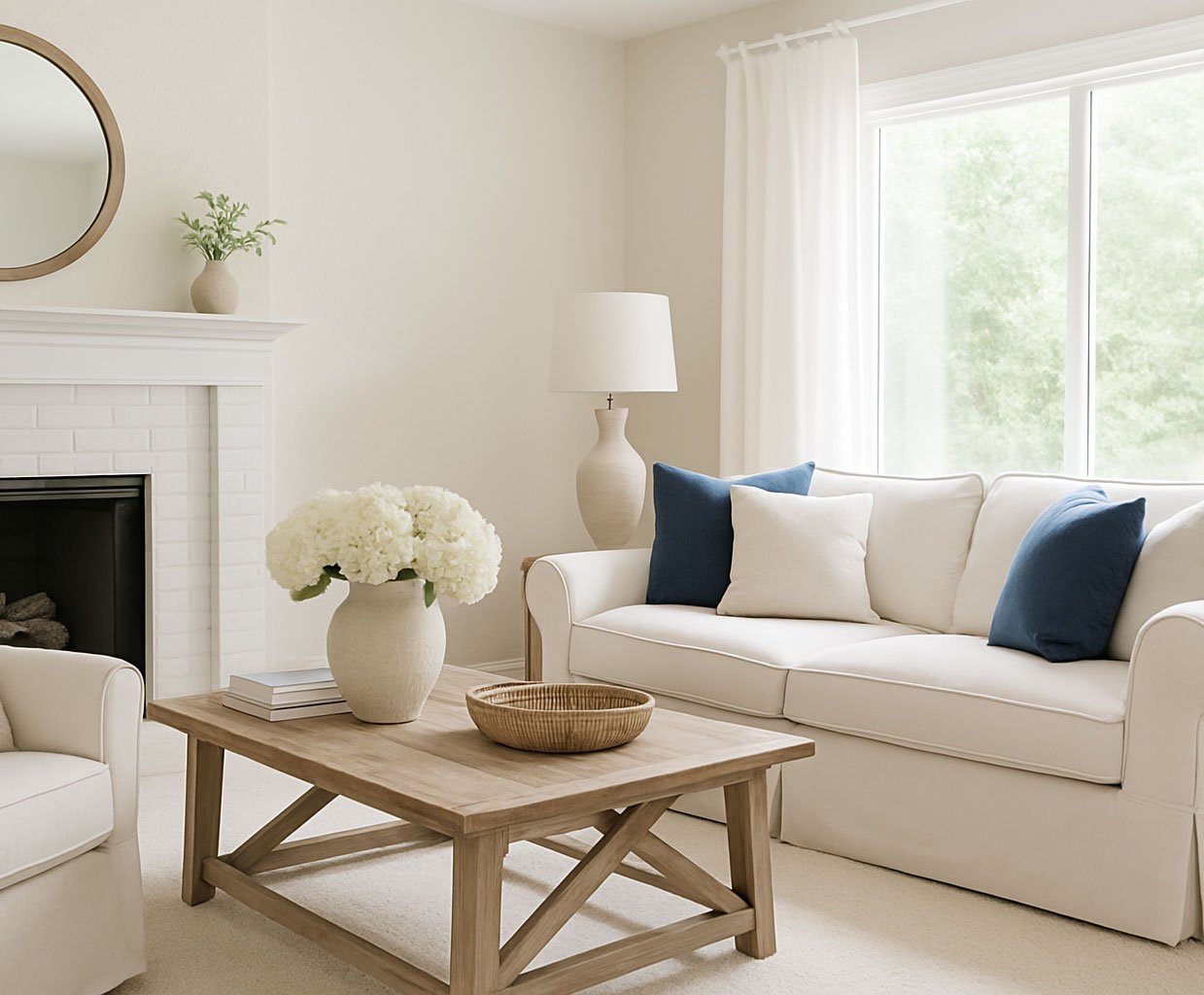
First, let’s look at example that doesn’t follow the “rule”. This room is mostly white/cream with a few touches of wood and some blue pillows. It’s probably 80% white, 10% brown, and 10% blue.
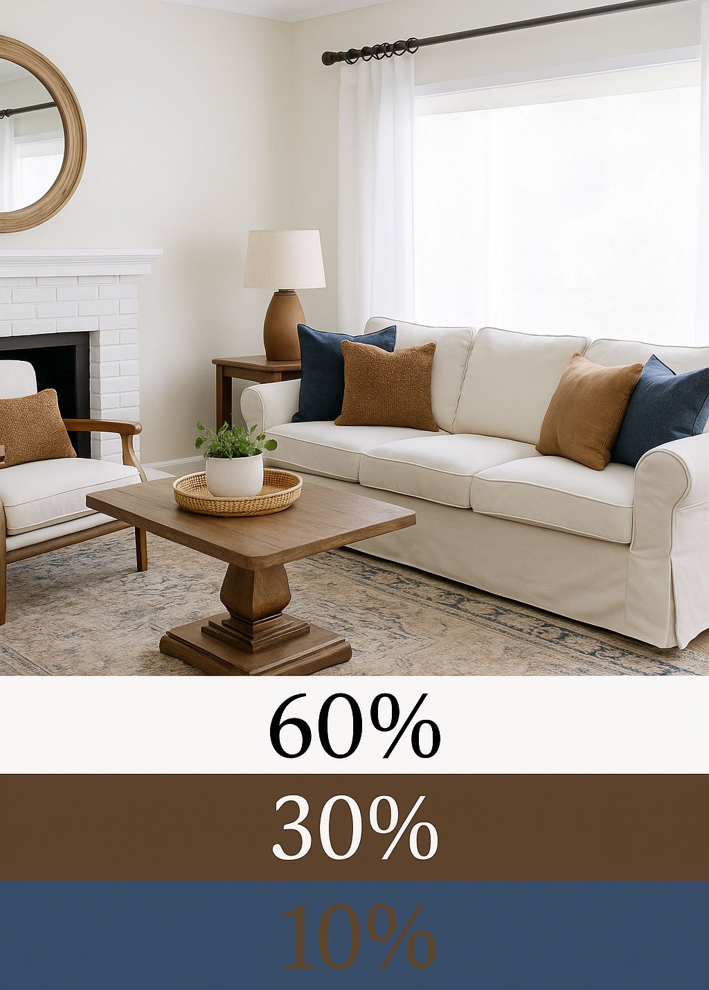
Below, I’ve fixed it up a little to bring in more browns to balance out the white. You can see how much richer and layered the room feels:
Now let’s look at how the rule works in my own home!
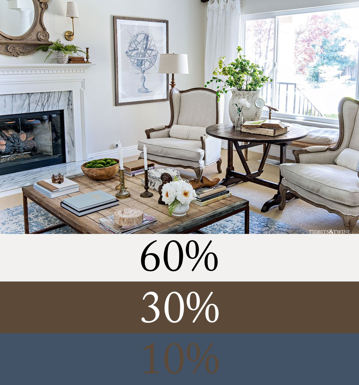
Spring Living Room
The 60% dominant color is the soft white of the walls, fireplace, and chairs, which sets a calm and airy backdrop. Warm wood tones in the coffee table, side table, mirror, and chair frames provide the 30% secondary color, giving depth and grounding. Blue and green accents in the rug, artwork, moss bowl, and greenery make up the 10% accent, adding just enough life without overwhelming.
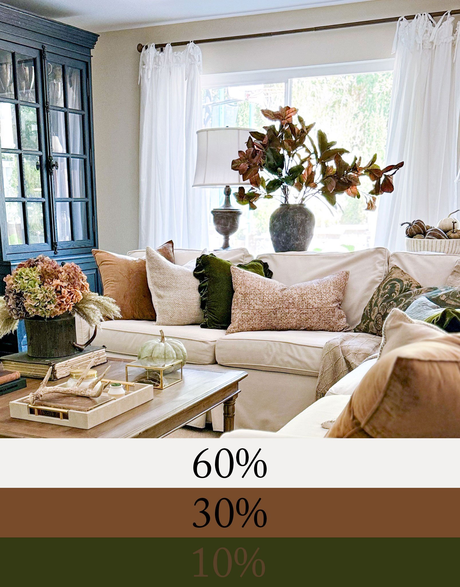
Fall Family Room
This room starts with a 60% neutral base—the sofa, walls, drapery, and carpet. The 30% secondary comes from the warm browns in the wood table, rust pillows, and hydrangeas. The 10% accent is green, repeated in the pillows, pumpkin, and foliage. By showing up in several places, the green looks intentional instead of random, which is exactly how the 60-30-10 rule works its magic.
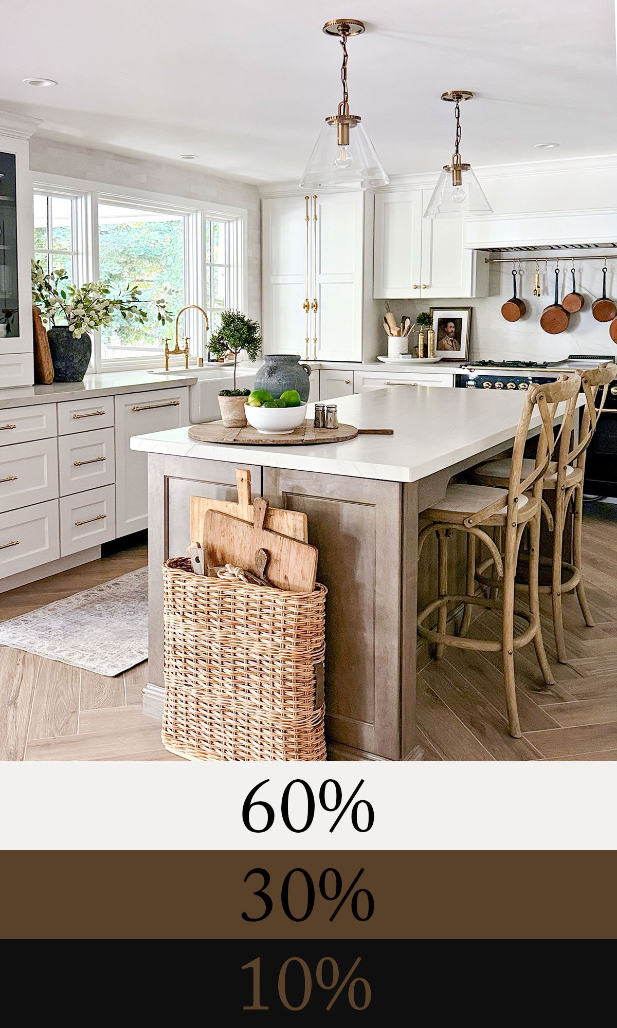
Warm White Kitchen
White is the obvious 60% dominant here, from the cabinetry and counters to the walls and ceiling. The 30% secondary is warm wood, repeated consistently in the floors, stools, island base, and cutting boards. The 10% accent is black—seen in the stove, cabinet trim, and portrait frame—with just a touch of copper for sparkle. The result feels fresh and bright, yet grounded.
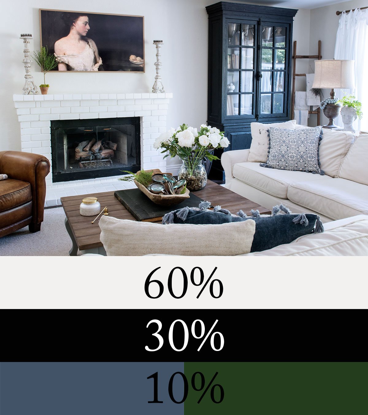
Spring Family Room
Here, white once again leads as the 60% dominant—seen in the walls, sofa, and fireplace. Black takes the role of the 30% secondary, thanks to the large cabinet, fireplace trim, and framed TV art. The 10% accent is shared between blue (pillows and throw) and pops of green spread throughout. Mixing accents this way shows how flexible the rule can be.
So yes, you can have multiple accents to long as the amount doesn’t creep into the next category above.
Designer Tips for Using the 60-30-10 Rule
Here are three ways to make the 60-30-10 rule even easier to apply in your own home:
1. Choose a hero fabric to support your 30%.
The secondary color is often the piece that gets overlooked, and a single fabric can make it much easier to pull off. Drapery, a patterned rug, or an upholstered chair that blends your wall color (the 60%) with your secondary (the 30%) does the work for you. That one piece often becomes the bridge that ties the palette together – often, but not always.
2. Pay attention to undertones.
Undertones matter more than you might think. If your walls lean warm, choose a secondary in the same family—olive, rust, or camel. If your walls are cool, slate, charcoal, or blue-greens will feel more at home. You can still mix warm and cool in a space, but keeping your 60% and 30% within the same undertone family creates cohesion. If you’re not sure how to spot undertones, I shared a full guide here: Choosing Color: How to Identify the Undertone.
3. Repeat your accent.
An accent color works best when it’s repeated at least three times. Whether it’s a pillow, a vase, and a piece of art, repetition keeps a color from looking like a random pop and makes it feel intentional. You can read more about it here: The Rule of Odds: Why Threes, Fives, and Sevens Look Best in Interior Design
Common Mistakes (and Fixes)
- All pillows, no plan. Pillows alone can’t carry a secondary color. Add it in larger items like drapery or a chair.
- Too many little accents. If everything is an accent, nothing is. Keep them around 10%.
- Forgetting wood tones. Wood counts toward your 60% or 30%—don’t forget to factor it in.
FAQs
Yes! The 10% slice can be shared between two or three colors. The key is that, together, they don’t creep into the 30% territory.
It can. Sometimes your secondary layer is one strong color, like green or black. Other times it’s a pair of colors that work together—like the warm browns and deep greens in my Fall Family Room. As long as they combine to about 30% of the room, they’ll still read as balanced and intentional.
White makes a great dominant color! Just be sure to give your 30% a clear role so the room doesn’t feel washed out.
Black is one of the most versatile tools you can add. In many rooms, it works beautifully as a 10% accent—frames, hardware, a lamp base, or a side table. In other rooms, if black appears in larger pieces (like cabinetry or a sofa), it can easily step up into the 30% role. For more on this, see my post: Why Every Room Needs a Touch of Black.
Not exactly. A monochromatic room technically breaks the rule, but you can still use proportion: lighter shades act as your 60%, mid-tones as your 30%, and the darkest as your 10%.
Yes, but in a looser way. Maximalist rooms often layer many colors and patterns, so the proportions aren’t as strict. Still, the eye naturally looks for hierarchy. Even in a bold, collected space, you’ll usually find one color that dominates, one or two that support, and a handful that act as accents. Think of the 60-30-10 rule as a way to bring order to the mix—not to stifle it.
Final Thoughts
The 60-30-10 rule isn’t about restriction—it’s a shortcut to proportion. Start with what you already love, then use this simple framework to keep your dominant, secondary, and accent colors in balance. When you follow it, your space feels layered, intentional, and uniquely yours.

Join the Community
Let’s keep in touch! Get exclusive artwork plus the latest news delivered directly to your Inbox!