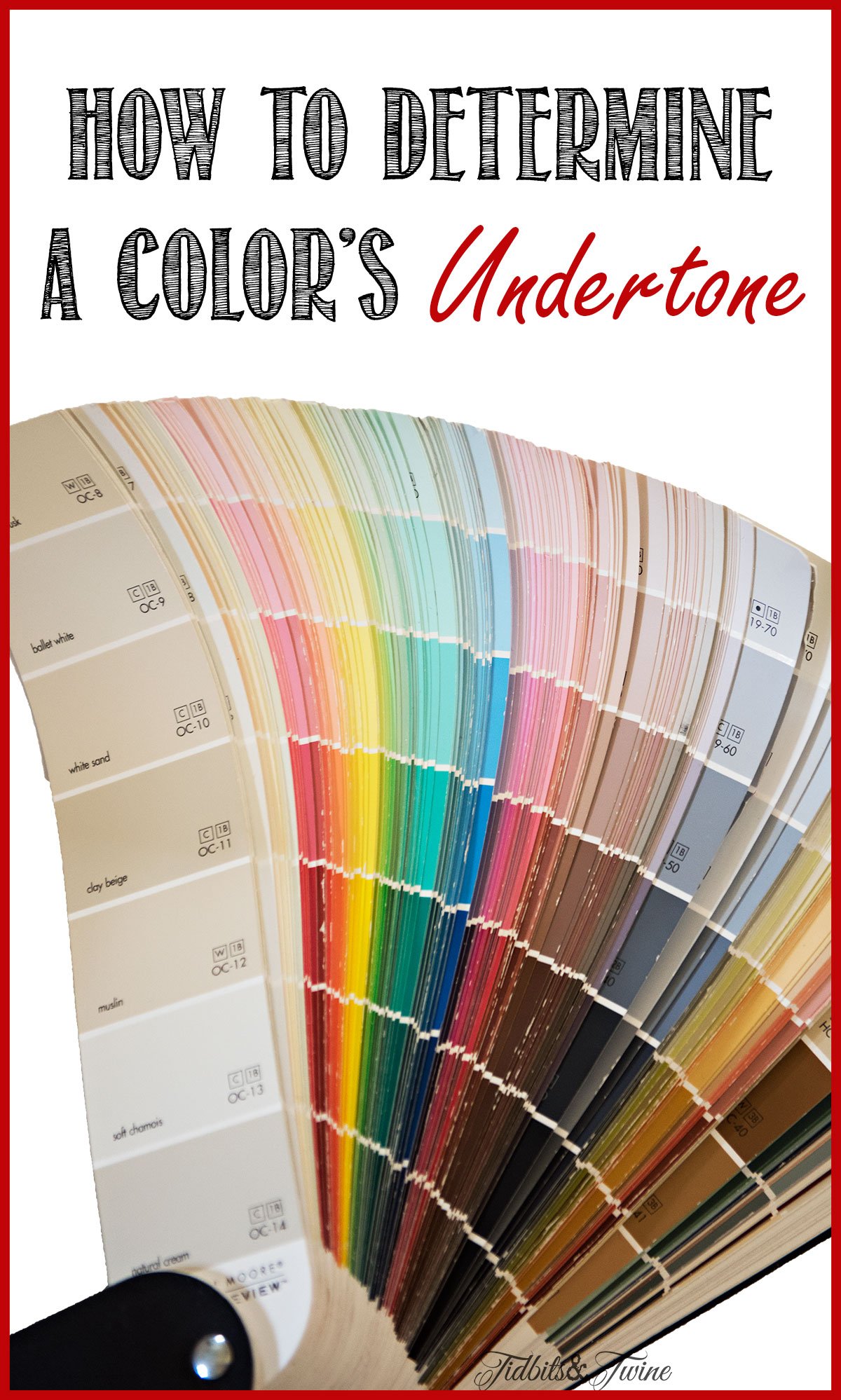
Choosing color, whether paint for the walls, fabrics for furniture, or new floors, can be SO tricky and frustrating! Not only are there so many colors to choose from, but they look different in the store than they do at home so it seems they are always changing. Add to that the undertones and the process of choosing a color is even more complicated. When decorating a room, it is usually easy to find the right masstones but if the undertones don’t work, the entire color scheme can look just a bit off.
So how can you determine the undertone of colors? Here’s how.
Color Definitions – Masstone & Undertone
Before we begin talking about how to determine an undertone, it’s important to understand what it is! With the exception of the three primary colors {red, yellow, and blue}, all other colors are made by mixing two or more colors together. A masstone is the major color – the one that is immediately apparent. An undertone, on the other hand, is the color that has been mixed in, which may or may not be immediately apparent. For example, blue with a bit of yellow mixed in will look different than blue with a little green mixed in {moss green versus aqua green}. For some colors, the masstone and undertone are very similar and other times, they can be very different.
How to Identify the Undertone
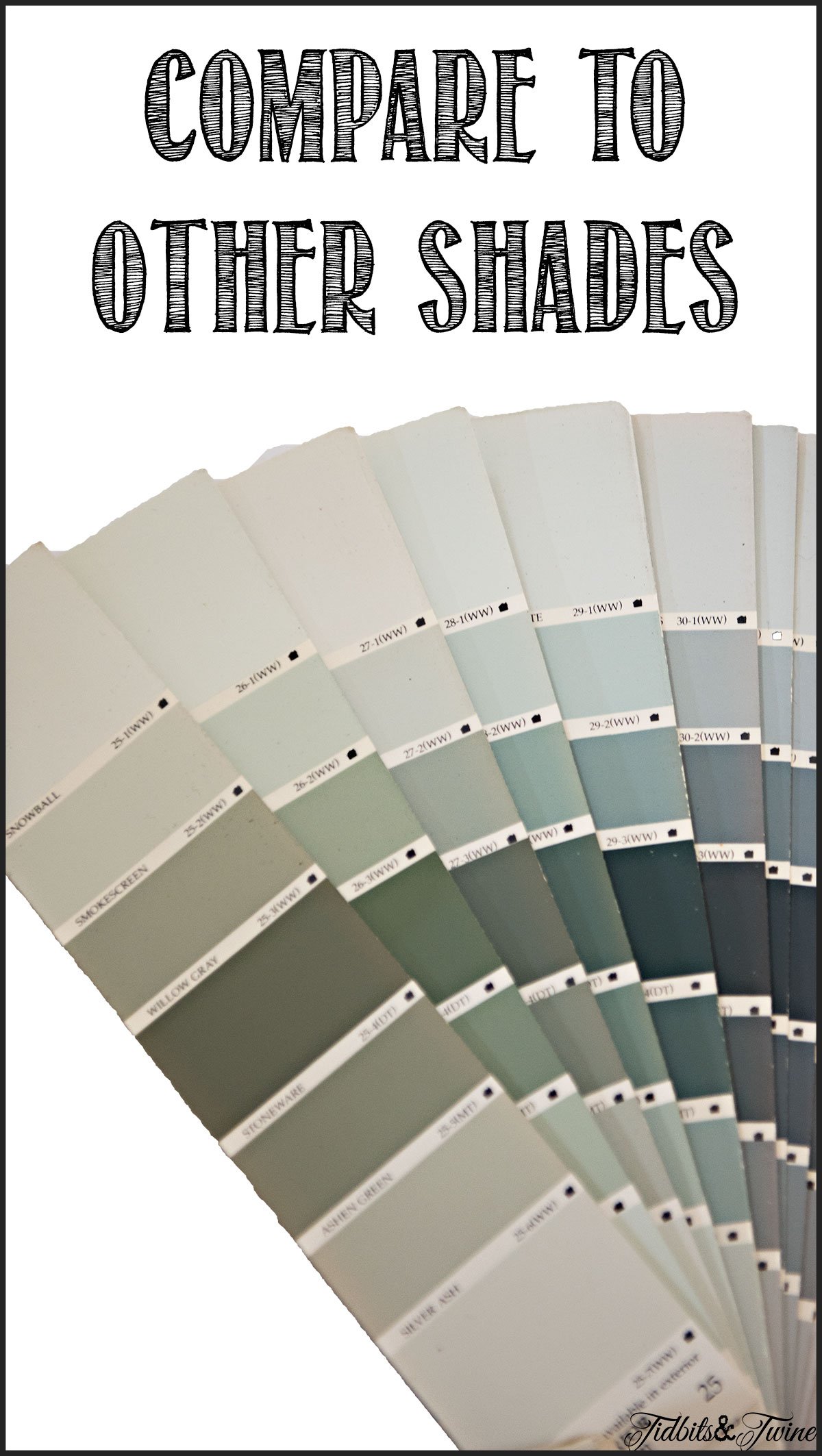
1. Compare It to Other Shades
The phenomenon that makes colors appear different depending on what they’re next to is called Simultaneous Contrast. One way to determine an undertone is to place the color next to other colors and see how your original color shifts.
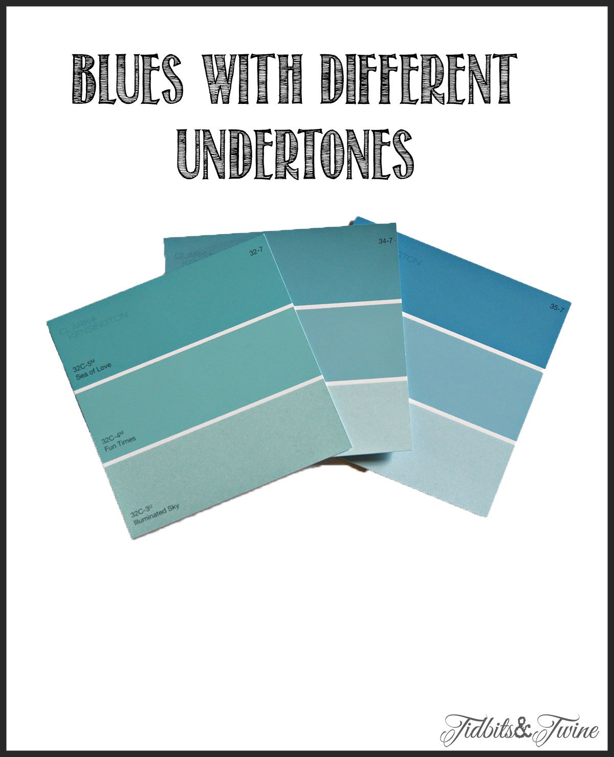
One method of comparing colors is to compare your selected color to other shades of the color that are in the same color family.
Let’s look at the color blue for instance. Here is a look at pale blue on the paint fan, but they vary in their undertone. The ones on the left have a green undertone, whereas the ones toward the right have a purple undertone, giving them a more periwinkle appearance. By comparing different shades, the undertone starts to become more apparent.
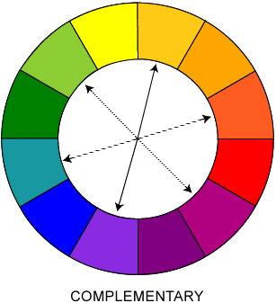
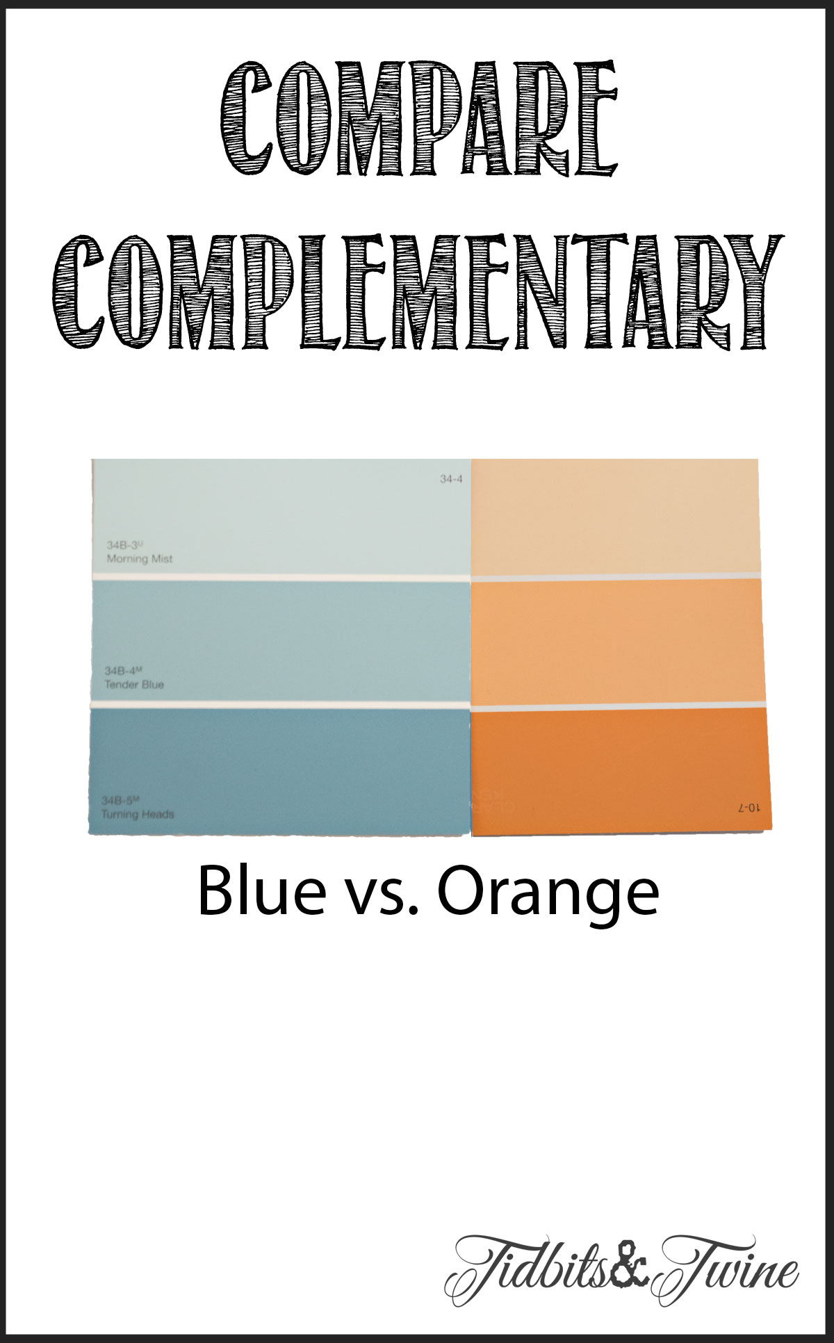
2. Compare it to Other Hues
Another way is to compare your selected color to other hues. One way is to compare complementary colors. For example, to see if your blue has any red in it, you’d compare it to green. To see if it has green in it, compare it to red. To find if it has yellow, compare it to purple.
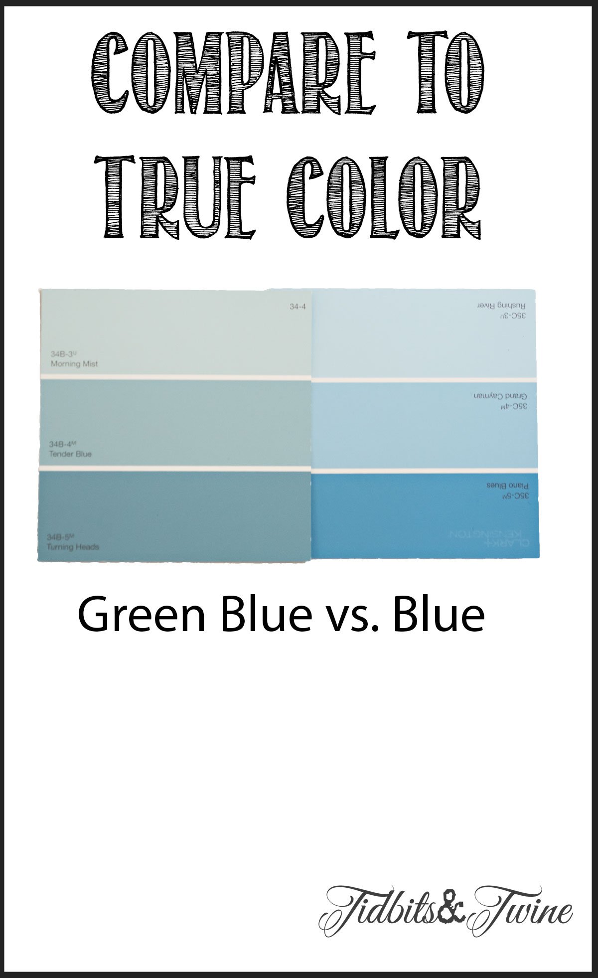
You can also compare a color to it’s true color. Here, the color on the left looks blue when compared to orange:
When compared to a truer blue, though, you can see that it has some green in it!
3. Look at it In Your Space
Because colors are influenced by the light and by their surroundings, it’s very important to look at a color in the space you intend to use it. In one room, a slight undertone might go unnoticed but in another, it might become exaggerated and stand out! The only way to really know is to look at it in the space you intend to use it and various times of the day {so that you see it in all different types of light}
4. Take a Picture
I’ve learned that not everyone’s eyes are equally sensitive to colors. Some people truly have a hard time seeing undertones, no matter what other colors you compare them to or what light you look at them in! By accident, though, I discovered that undertones tend to pop more in photos, allowing those who have a hard time seeing undertones to more easily spot them.
This last weekend, my husband and I went shopping for new wood floors {more about that later}. We picked out two browns that in daylight, looked nice and neutral. When I got home, though, I saw a problem! One of our neutral floors had a red/purple undertone and no matter how much my husband looked at it, he just couldn’t see what I did. {Red is the one color that won’t work in my house.} He happened to be looking over my shoulder when I snapped a picture, though, and suddenly, he could see exactly what I saw! Can you see it here?
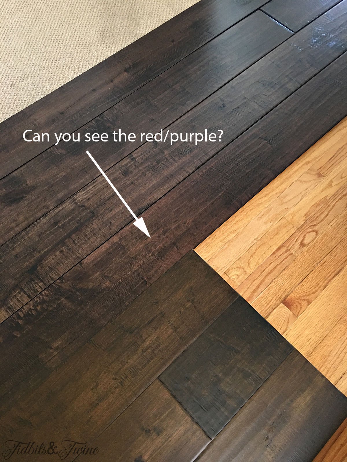
So when in doubt, take a picture!
If you’ve ever gone to the paint store and wondered why there are so many choices, now you know and hopefully, you now know how to spot undertones a little bit better!
Need more info about choosing the right paint color! Try THIS POST!


Join the Community
Let’s keep in touch! Get exclusive artwork plus the latest news delivered directly to your Inbox!
Thank you for the great article! I will be referencing this page in an article I am currently writing on the importance of color.
I have walls in my living room that have a light yellow overtone. I do not like it, but want to paint an accent wall to help tone the yellow out to more of a tan. I do believe it was met to be tan, but had yellow overtones.
I really appreciate this information. I am trying to recognize undertones, though difficult for me, so I will experiment with some of these suggestions – especially taking a picture.
Hi Donna – Undertones are really tricky, but comparing an item to other colors really does help, as does taking a picture. Good luck and I hope one of these suggestions works out for you! :) Kim
got so much good information from this post. I found out about the color showing up in pictures by accident recently. Now I know why our browns always have a green cast in our home.
Hi Sharon – Isn’t the picture thing just the craziest ever?! It really does help identify colors, though, doesn’t it? Now hubby and I can finally be on the same page when talking about our home…I always wondered why he couldn’t see what I could see! Lol! :) Kim
Kim, you have great tutorials and I always glean something from every one. One of the reasons I like your blog is the information you share is foundational, always goes just a bit deeper than ‘just the basics’ and can be applied irrespective of decorating style.
Hi Colleen – You are so sweet to leave me this nice comment. I really try to make my posts informative but I never really know if others find them helpful, so I really appreciate this feedback! Have a wonderful week and thank you so much for taking the time to visit! :) Kim
Thank you for the wonderful tutorial. I did know about undertones, but had never heard of Simultaneous Contrast. Thank you so very very much. This is wonderful information that I will be thrilled to use going forward!!!
I’m so glad you found it helpful, Susan!! :)