
One of my all-time favorite color combinations is blue and brown because it conjures up thoughts of nature and is a soft, soothing color palette. In particular, I love a soft grayish-blue mixed with all shades of beige and greige neutrals. This color palette works well in the Winter if you bring in other cool tones to complement it, but works equally well in the Spring with pops of green, pink, or even yellow!
I am a neutral-lover at heart, so I prefer my big ticket items, like walls, floors, and furniture, to stay neutral. Collingwood from Benjamin Moore has a classic look that can provide a pretty greige backdrop for a room. Philipsburg Blue is a beautiful, complementary shade.
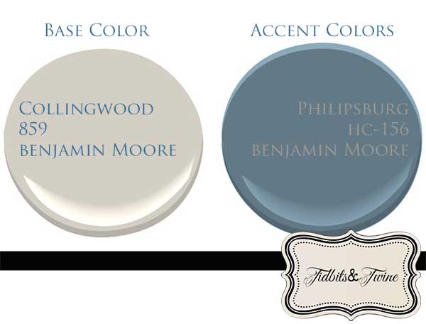
The key to decorating with neutrals, though, is to use a lot of varying shades and textures so that they room doesn’t feel cold or sterile. Natural fibers mixed with shiny finishes, chunky textures mixed with elegant weaves, etc. It’s all about creating dimension, depth, capturing the senses, even in the absence of color.
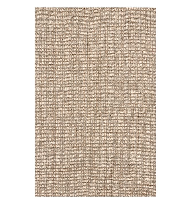
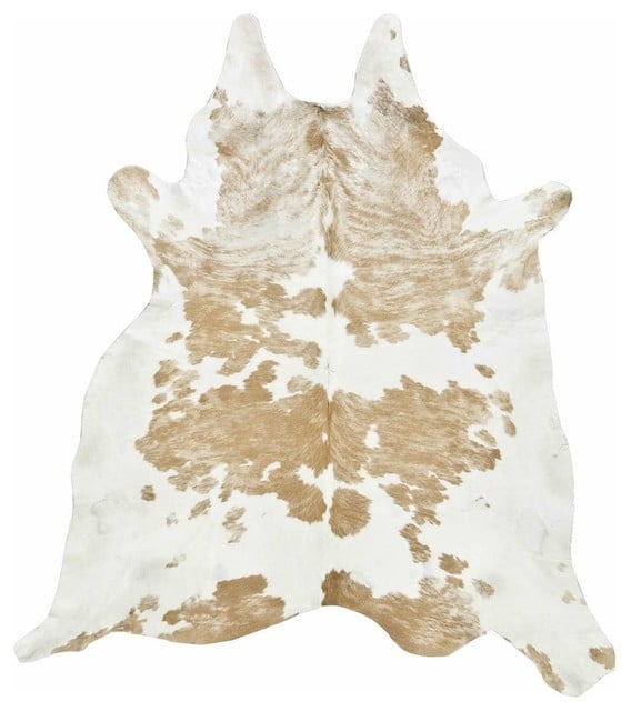
On the floor, I love the layered look of rugs, like Pottery Barn’s Chunky Wool and Jute Rug along with a Cowhide Rug like this one from Ballard Designs.
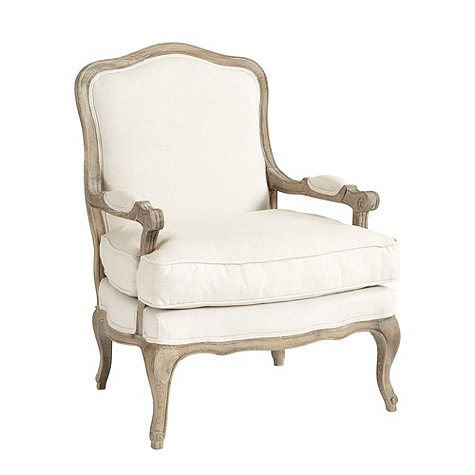
Furniture pieces can take on tones ranging from white, to off-white, beige, camel, flax, and even leather!
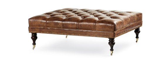
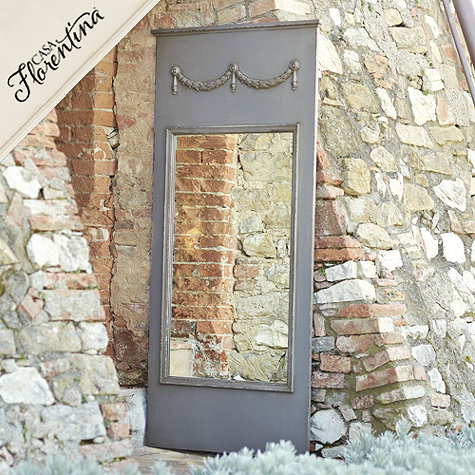
Since I change my mind quite a bit about color, I tend to save my use of color for accent pieces and accessories, like artwork, mirrors, objects, pillows, etc. I love this beautiful sketch art from Home Decorators Collection and the Colette Mirror from Ballard Designs.

And then there’s my all-time favorite fabric, Ozborne Village, which is beautiful for pillows, draperies, and more!

This is truly one of my favorite color combinations and one that you’ll see repeated through my home, but depending on the season and my mood, I do tend to add a tertiary color in small doses just to change the look up a bit!
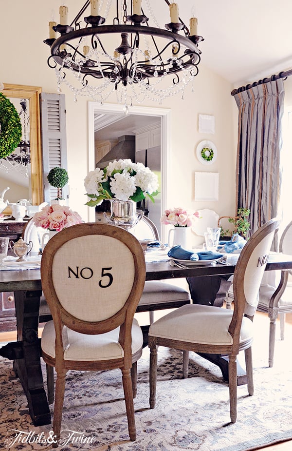
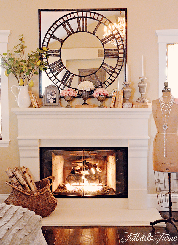
Have a wonderful weekend!

Would you like to receive my posts via email? Enter your email address below. You will instantly receive an email from FeedBurner and you will need to click the link to activate your subscription.
Join the Community
Let’s keep in touch! Get exclusive artwork plus the latest news delivered directly to your Inbox!

Love , love your dining room.
Thank you so much, Linda!
I have enjoyed reading your blog. Truly inspirational and so many great ideas! I love your dining room rug. IWoukd you share your source? I too have used a lot of blue gray in my home with soft neutrals and think this would make a great addition. Thanks so much and congratulations on your guest blog for World Market!
Hi Cheryl – Thank you so much! My dining room rug is actually from Target. Right off the shelf! And I must admit that it’s held up incredibly well. I have another rug in the same color palette from Pottery Barn but it’s wool and it sheds like crazy, whereas the Target one doesn’t. I don’t remember the price exactly but I think it was between $200 and $300. :) Kim
Love the inspiration board. I’ve been trying to find a wonderful fiddleleaf fig for sometime. The nursery has had them but they often look battered. The color combination is classic. I have such trouble with choosing paint. Nice post.
Karen
Great colors and inspiration board. I love your dining room, one of my all time favorites.