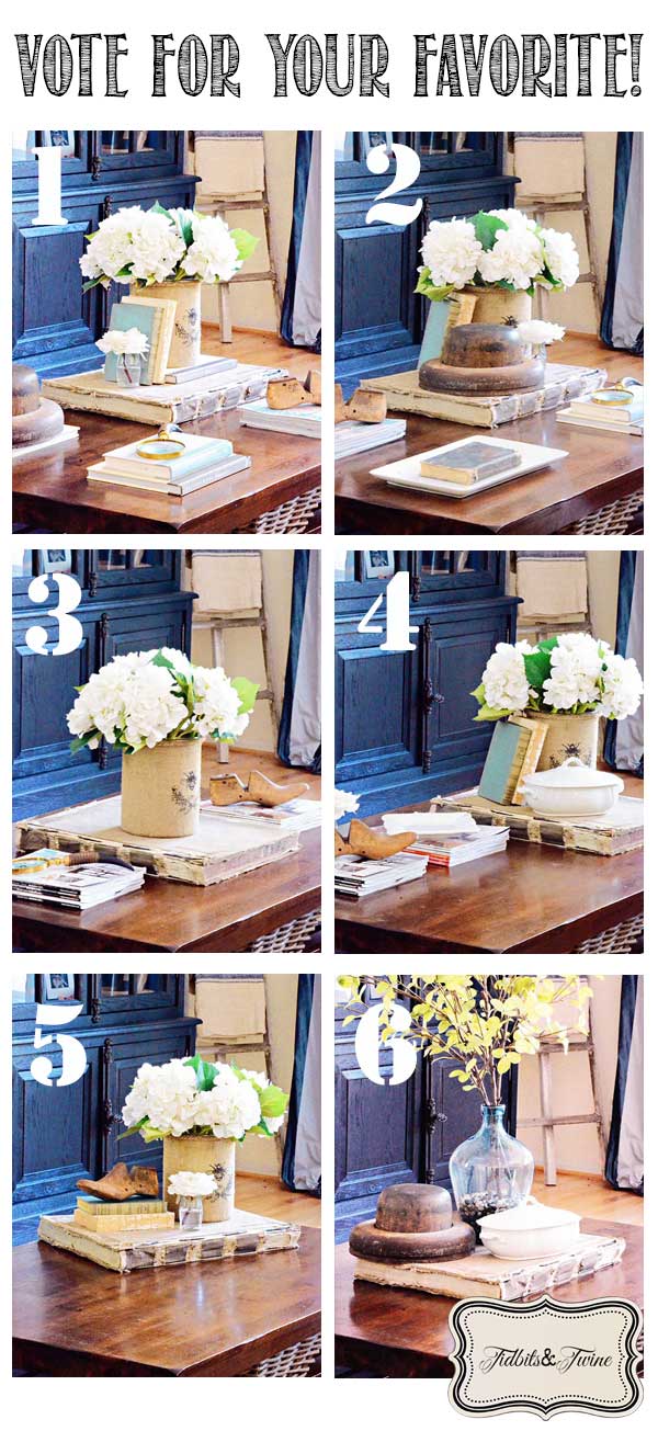
During my shopping trip at Alameda Point, I came across something that I’ve wanted for a long time…an oversized book! And better yet, this vintage beauty came from France courtesy of Atelier de Campagne. I knew right away that I wanted to use it on my coffee table and couldn’t wait to start decorating with it. I ended up putting together six different designs – all of which include the book – and would love your input as to which is your favorite!
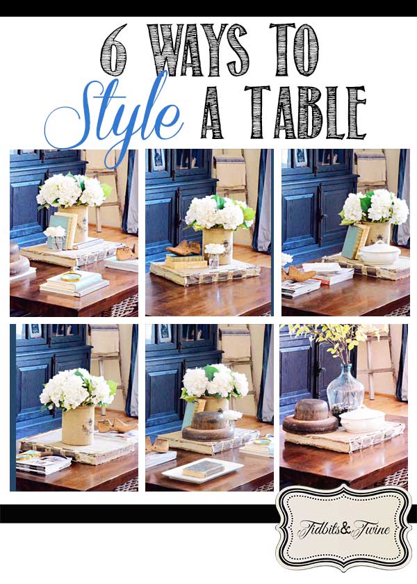
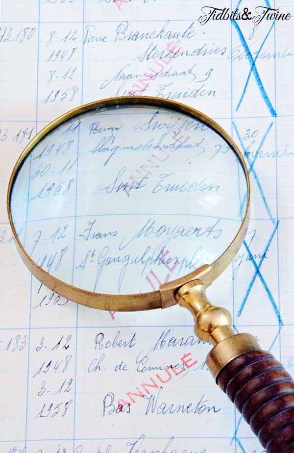
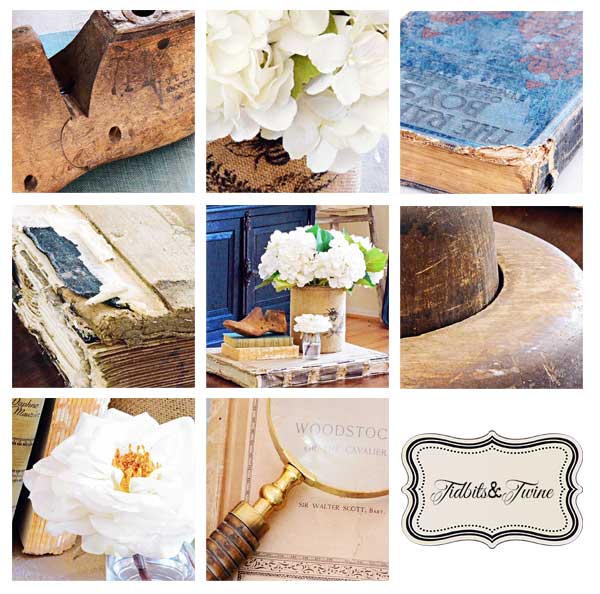
Before I started, I cleared everything off the coffee table so that I could start with a clean slate. I then added the book, which was the one thing I definitely wanted to include. The book is actually a vintage business ledger, and clearly, it’s very worn and delicate. I love the way paper ages, though, and feel it just adds to the character of the piece.

I have no idea what it says inside, but I’ve had fun looking through all of the pages!
I gathered up a bunch of other accessories that I thought would pair well with the book. You’ll notice that I used the same items over and over but grouped them differently for each of the designs, thereby changing the look of the table. The one constant was the book, of course, but even that moved around to create different focal points.
I’ve posted before about different design approaches for styling a coffee table and I followed those different approaches below. You can read the original post {here}.
1. The Four Corners
I placed a grouping of objects in each of the four corners of the coffee table and tried to balance out the rustic and elegant items.
2. The Four Corners – Variation
This is the same approach, but I changed out some of the objects to create different groupings, giving a little more visual weight to the grouping with the book.
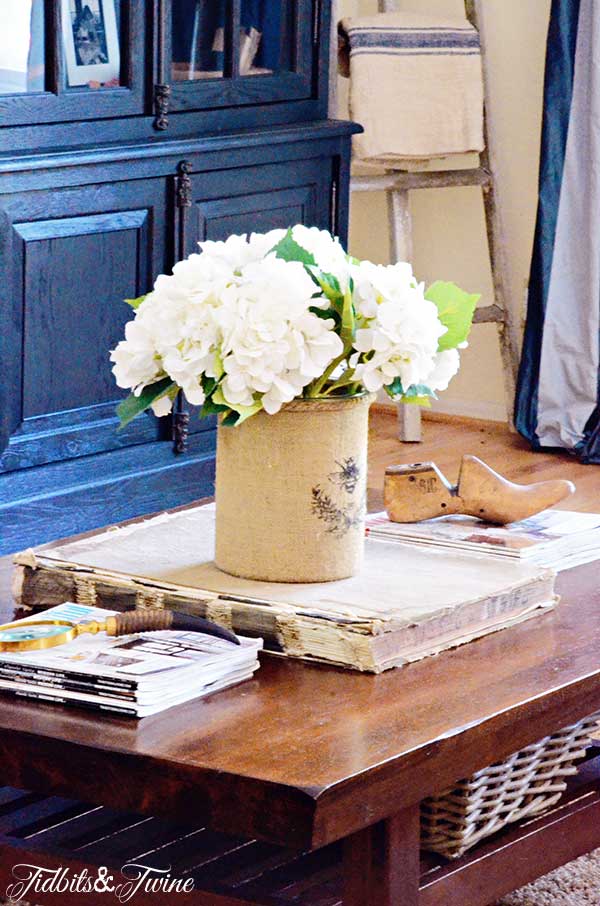
3. Long & Linear
I started by placing the book in the middle and then flanked it with smaller groupings of books. I kept this design very simple to help streamline the overall look.
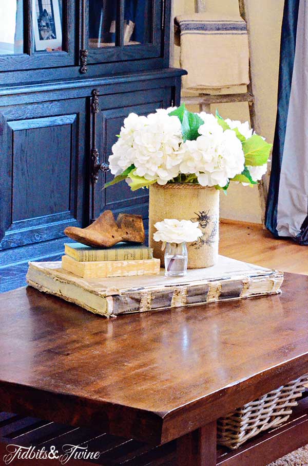
4. Long & Linear – Variation
I kept the items running lengthwise along the table, but shifted some of the positioning.
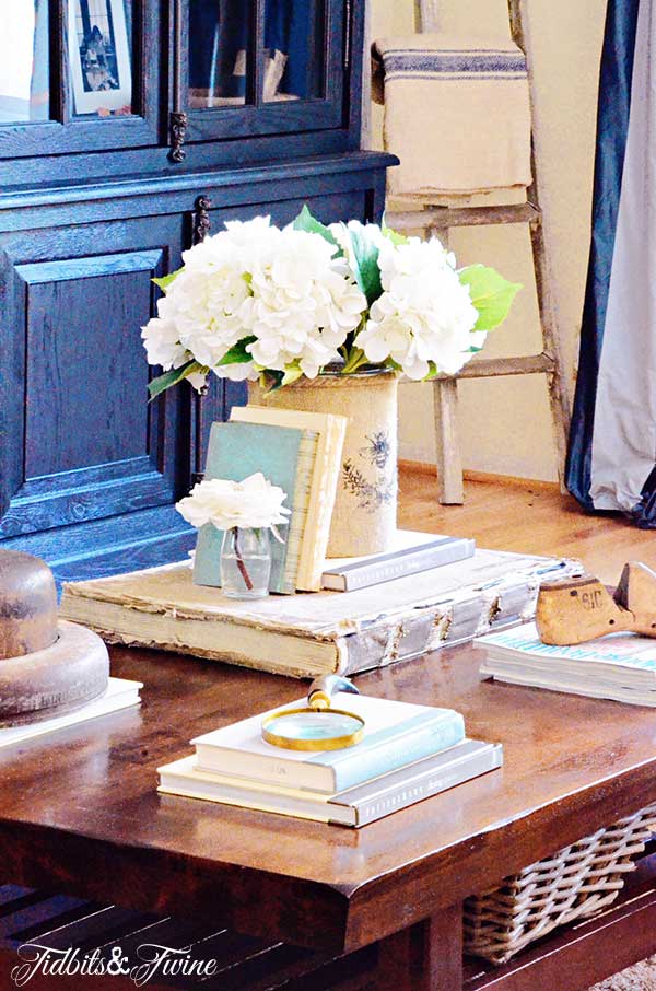
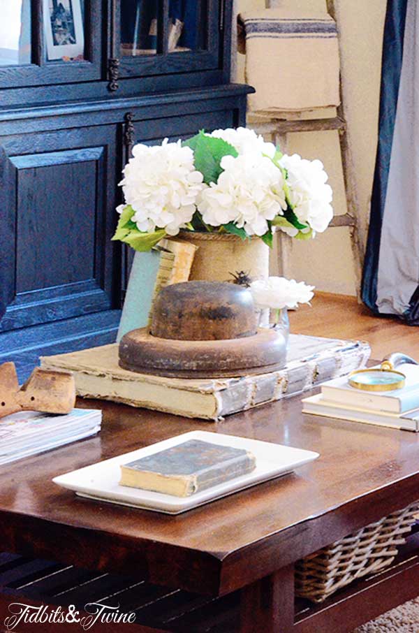
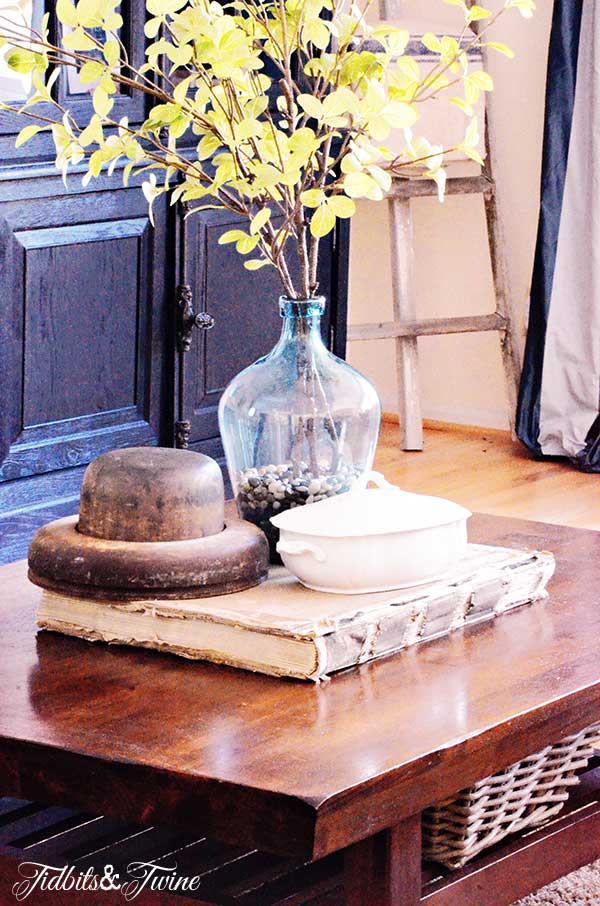
5. The Contained Grouping
While groupings are normally contained within a decorating tray, I decided to contain my grouping on the book. It is pushed diagonally off to the corner, which allows for more free space on the table itself.
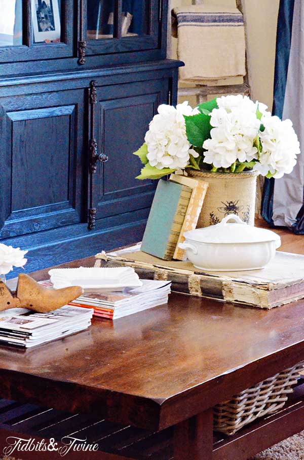
6. The Center of Attention
I made this grouping bigger and showier than the previous ones with the addition of a blue bottle filled with pebbles and greenery. The entire display is centered on the table to ensure it is truly the center of attention.
Those of you that have been reading my blog might notice that these photos have all been taken in my family room, which is my kids playroom – probably not the best place for a delicate, vintage book and ironstone! Not to worry, this design will actually be used in my living room, which is an adult space, but I don’t have a coffee table in there yet and so couldn’t photograph in that room. But you can let me know which is your favorite for when I finally pull my living room together!
So tell me, which one is YOUR favorite?

Would you like to receive my posts via email? Enter your email address below. You will instantly receive an email from FeedBurner and you will need to click the link to activate your subscription.
Join the Community
Let’s keep in touch! Get exclusive artwork plus the latest news delivered directly to your Inbox!
I like #5 the best and #6 second.
Four corners looks great, but is not good for everyday living. I like #5 because I like using trays for groupings and also because it allows the table to be more functional. The book is a neat alternative to a tray. I actually use a vintage wall mirror on my own coffee table for my grouping. It instills a feeling of sylishness functionality :) Also love your bumblebee canister! Great job Kim!
I like five with number six coming in a close second.
I like #5. That is more my style. A grouping without the rest of the table feeling cluttered. Room to set a glass or appetizer when entertaining.
6deffinitely!
I like #5 the best. I love all the texture and different items used to give interest. This is my type of coffee table arrangement.
I like the cleanness of 5. And, it includes items that really appeal to me. Great job on all of the variations.
Love all of the extra items you chose for styling – but I really like the look of #5. The large book is lovely, and #5 really lets you appreciate its beauty.
#5 is my favorite
Number 5 is my favorite!
I like #1 the best, 4 corners of goodness. But for practicality I would go with #5. Oh that book!!!!! I knew I should have gone to Alameda on Sunday:)
#5 ~ Replacing the Wooden Shoe Mold with the Magnifying Glass would Complete your Coffee Table Story……
Five and room for daily living space
#6