These are my favorite warm whites that create a traditional, cozy backdrop on your interior walls. I tried and tested over 35 off-white paint colors and narrowed it down to these 8 as the best warm white paints for your home. Learn more about each color including LRV, undertones, and examples!
What I love about a neutral backdrop is that it gives you freedom with the color palette of your furnishings and decor. Your collected treasures tend to pop more against a neutral backdrop, allowing you to rotate decor in and out of your space without ever worrying about whether it’ll clash.
But not all whites are created equal. Okay, technically speaking, the colors I’m sharing today are off-whites (more on that below).
I actually spent MONTHS during quarantine playing with paint colors and trying to decide what I wanted for my own home. (I had a lot of time on my hands!)
I took all of my learning from all of my sampling and boiled it down to these 8 paint colors that are my favorite warm whites for a neutral backdrop. I’ve listed a few more at the bottom that didn’t quite make my list but are still beautiful, just in case none of these strike your fancy.
Need to learn how to properly sample paint colors for your home? I put together a full tutorial for How to Test Paint Colors just for that reason!
Warm Whites vs Cool Whites
Cool whites lean toward blue or gray, whereas warm whites appear creamier or with hints of tan. The undertones of warm off white paints are actually blue, purple, or green, but the goal for a truly neutral (if there is such a thing) paint color is for these undertones to be neutralized so that they aren’t really apparent.
Warm white paint lends itself to a more traditional feel with a soft look. Think of them like a warm, gentle hug. Okay, maybe that’s a stretch, but warm whites do evoke a cozy feeling!
What is LRV?
LRV, or Light Reflectance Value, is how light or how dark a color will look on a scale of 0 (black) to 100 (white).
The higher the LRV (closer to 100), the more that colors from surrounding objects will be cast on the wall. A paint with an LRV of 75, let’s say, will have a green cast if there’s a lot of green outside the window. Or maybe pink if you have a red tile roof.
On the other hand, paint with an LRV less than 50 will soak up more light than it reflects and so will not reflect its surroundings the same as paint with a higher LRV.
What Are Off White Paints?
Off white paint colors have an LRV anywhere from about 66-82 (based off of manufacturer’s color collections). Anything above 82 is really considered more of a true white. While off-whites are still very light, they generally have just enough color to show some contrast with white trim.
How Important is Lighting
Because off-whites have a high LRV, they are very susceptible to lighting. Brightly lit rooms can wash out some off-whites. And color from reflective surroundings can bounce off the walls and cast color. Not to mention that south-facing rooms have a more yellow light and north and blueish light.
All of these lighting differences will affect how the paint will look in your home, which is why it is so important that you try before you buy!
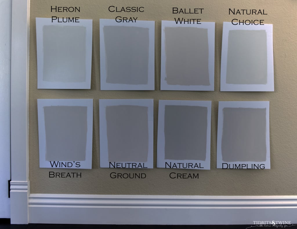
Okay, now that the technical stuff is out of the way, let’s get down to the good stuff…the list! I’ve put these in order from highest LRV (lightest) to lowest (darkest).
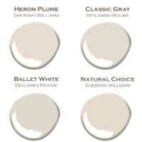
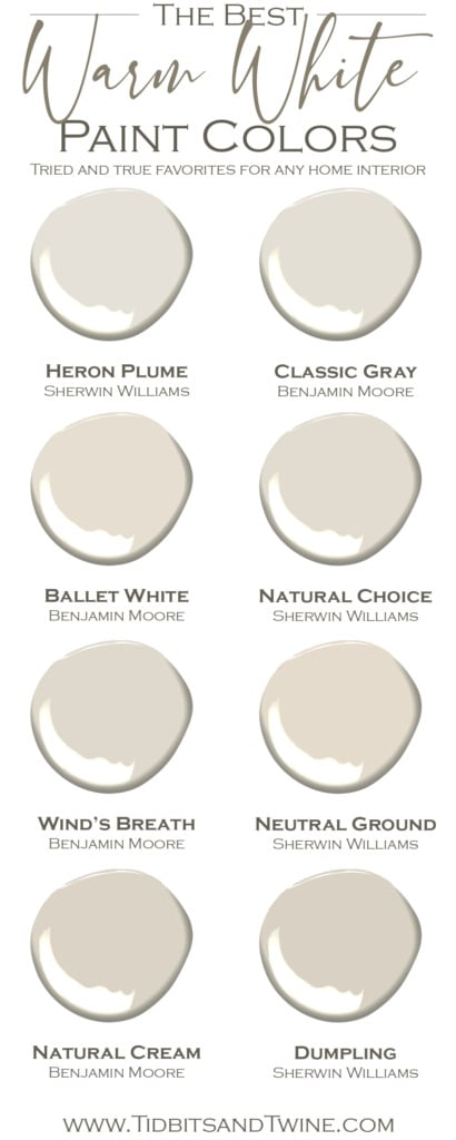
Heron Plume – Sherwin Williams
LRV: 75
Heron Plume (not to be confused with SW White Heron) is a lovely, warm off-white. It reads as a very light greige (that’s a gray/beige combo for those of you that thought that was a type-o). It can, depending on the lighting, have a slight pink undertone (but not nearly as much as Pale Oak), which is why is so important to test paint colors in your home.
Once upon a time (okay, in 2014), Heron Plume was one of Pottery Barn’s colors through their collaboration with Sherwin Williams. So, you know that means it’s a great neutral that coordinates well with other colors.
Classic Gray – Benjamin Moore
LRV: 74.78
Classic Gray is one that I feel like everyone talks about. The name is sort-of a misnomer, though. To most, gray is a cool color and while Classic Gray is probably the coolest on my list, it’s actually a warm gray.
While absolutely beautiful, Classic Gray can wash out in a bright room because it is so light. Again, always sample in your home to see how a color will actually look in your space.
Ballet White – Benjamin Moore
LRV: 73.68
Ballet White really is the chameleon of colors. It definitely has a warm, creamy base but depending on the lighting, it can lean quite a bit toward the greige side.
Now don’t let my use of the word “creamy” scare you away. Yes, it has a yellow base, but unlike other cream colors, the neutral base that really tones down the yellow and makes it….well, neutral!
You can learn more about this color in my Complete Paint Review
Similar to Ballet White
If Ballet White is close but not quite right, try Sherwin Williams White Duck OR Farrow and Ball Schoolhouse White. Both are extremely similar!
Natural Choice – Sherwin Williams
LRV: 73
Natural Choice is a creamy, warm white that isn’t too yellow and isn’t too gray. It does have a touch more green than the others here, but overall, it’s just a nice, natural choice! (Pun intended!)
Wind’s Breath – Benjamin Moore
LRV: 70.69
Compared to Ballet White, Wind’s Breath leans more toward taupe than cream and is just a beautiful, warm neutral. Like many off-whites, it has a pink undertone so be sure to see how it looks with other elements in your home.
Neutral Ground- Sherwin Williams
LRV: 70
Neutral Ground is a soft tan. It doesn’t have the orange or pink undertones of other off-whites and instead has more yellow and green. Within this list, it seems to be the creamiest of the group, but overall, it is really neutralized and comes across somewhere between tan and greige.
Natural Cream – Benjamin Moore
LRV: 66.26
Think of Natural Cream and a beautiful mix of yellow and gray. I’ll admit I was hesitant to try this one because of the name. I thought “cream” would be too yellow, but Natural Cream is really a beautiful light greige.
Similar to Natural Cream
Interestingly, Benjamin Moore Tapestry Beige is very similar but I found it to have a bit more yellow than Natural Cream. Ironic given the name choices….
Dumpling – SHERWIN WILLIAMS
LRV: 64
If you want a darker, warm off-white without too much color, Dumpling might be just the color you’ve been looking for! The darkest on my list, Dumpling is a beautiful warm greige.
But, I’ve got good news and bad news when it comes to Dumpling. Let’s start with the bad news. Dumpling is part of Sherwin Williams’ Emerald Designer Edition, meaning that it is only available in the Emerald line (the most expensive). The Designer line has a few different collections and Dumpling is part of their Warm & Welcoming collection. But the real bad news is that since it’s only available in Emerald paint, it cannot be made in the regular sample pots!
The good news is that Sherwin Williams can color match their own Dumpling paint chip and make it in any line of paint, including the sample pots. Now, they’ll tell you that they can’t match it exactly because the Emerald line yadda yadda yadda. I’m sure that’s true…to a point. But I’ll be honest, I put the color match they made for me on the Dumpling paint chip and I honestly couldn’t tell the difference between the two no matter how hard I tried.
So, if Dumpling interests you but you don’t want to pay the higher price, just ask for a color match!
Dumpling is still so new I couldn’t even find a picture of it to show you. Instead, here’s a lineup of ALL of the colors so you can see how Dumpling relates to the others I’ve listed here. I had to turn the brightness waaaaay down so as not to wash the colors out on the screen!
Other Neutrals to Consider
There are some other very popular neutrals you can consider if none of these quite meet your needs.
Pale Oak – Benjamin Moore
This is actually quite a gorgeous greige color and one that I considered very seriously. With an LRV of 69.89 is has enough color to contrast nicely with bright white trim. It can take on a pink undertone depending on the light, though. With my red tile roof and its high LRV, there was just too much pink for my home. But in another space, this is a beautiful color.
Aesthetic White – Sherwin Williams
This is a warm beige but leans more toward gray than some of the others on my list (with the exception of maybe Classic Gray). With an LRV of 73 it’s definitely an off-white but felt it had less color depth than others of a similar LRV. It is definitely a neutral, though, but can pick up a tinge of green depending on lighting.
Edgecomb Gray and Baby Fawn – Benjamin Moore
As if paint names were confusing enough already, enter Edgecomb Gray! It’s also in Benjamin Moore’s paint deck as Baby Fawn, but they are the same color. I’ll just refer to it as Edgecomb Gray from here on simply because that’s its more popular name.
Edgecomb Gray has an LRV of 63.88 and if I had wanted a bit darker of a color in my home, this would have been my number 1 choice! This is an absolutely beautiful warm greige color perfect for a whole house color. Depending on lighting, it can look more beige or it can lean more toward gray (but still warm). If the other paint colors on this list were too light for your liking, consider Edgecomb Gray!
How to Color Match
Don’t worry if there isn’t a Benjamin Moore or Sherwin Williams near you! Lowes also carries Sherwin Williams and ACE Hardware carries Benjamin Moore, but you can always order online or order from Samplize. Another option is color-matching.
Paint stores, including hardware stores, have a computer that can analyze a swatch and replicate q color in any brand of paint. The sample usually needs to be at least the size of a quarter, so bringing in a paint chip card is perfect!
The computer is usually pretty good at matching the color, but make sure that they test it on your swatch to ensure a perfect match. If it’s not close enough, they can do a hand-match. This means that a person adjusts the colors by hand until it’s perfect. This second option takes much longer but if you want an exact match, it’s worth it!
More Decorating Tips

Coming soon….my freshly painted interior!
Join the Community
Let’s keep in touch! Get exclusive artwork plus the latest news delivered directly to your Inbox!
I’m so glad I found you! I’ve been struggling with paint colors. We have Ballet White in our southwest facing living room it’s a beautiful light warm color during the day & at night the yellow undertone comes out.
I need suggestions for a neutral color for my Northwest low natural light family room. Ballet White Looks dull & flat in that room. We have dust bunny in the NW bathroom w/1 window it’s a very pretty light beige. I’m looking for a color to bring warmth into the FR. We have a light tan/beige sectional & medium blue accents. Any suggestions are helpful please. Thank you!!
Thank you for this article. I have neutral ground throughout my house and its lovely warm in all my rooms, but I’m remodeling my master bathroom that doesn’t get a lot of natural light with tinted windows. I’d like to do something brighter. Would classic gray coordinate well with it or is there another gray or off white that would? Thank you
I have saved your list of of preferred neutral paints for future reference. I have used Swiss coffee by Benjamin Moore in my kitchen and master bath. Next is the guest room. It, too, is a great neutral.
Hi Dianne,
I’ve heard so many great things about BM Swiss Coffee but haven’t yet personally tried it. But I know it’s very popular and it’s beautiful from the pictures I’ve seen. :) Kim