



Benjamin Moore Ballet White OC-9 is the warm, creamy neutral I chose for the walls throughout my home. But finding that perfect whole-house color? That took some work!
I wanted something that wasn’t too light or too dark. Warm, but not yellow. Tan, but not ’80s beige. Something that looked good in the warm light of a south-facing room and the cooler light of a north-facing room. And definitely nothing that flashed pink or looked dingy.
You know, just the perfect paint color! Was that really too much to ask?
With an open floor plan, I couldn’t easily change paint colors from one room to another, so I needed a neutral that would work everywhere. After testing several warm whites, I finally landed on Benjamin Moore Ballet White, and I’m so glad I did.
What I love most is how Ballet White changes with the light. In my south-facing living room, it looks warmer and creamier, while in my north-facing family room, it takes on a softer greige appearance.
Below, I’m sharing how Ballet White looks throughout my home, along with its undertones, trim pairings, and a few things to consider before choosing it for yours.
I recently wrote about my eight favorite warm whites. This list was based on my own experience sampling these colors in my home. I ultimately decided on Benjamin Moore Ballet White and am so glad I did! It’s the perfect warm whole house neutral. Here’s why.
What Color is Ballet White
Ballet White really is a chameleon of a color! Although Benjamin Moore classifies it as an off-white, it’s more of a soft, creamy neutral with just enough beige to give it warmth and depth. It isn’t a crisp white, but it doesn’t feel like a traditional tan or beige either.
And don’t let the word creamy scare you away! Ballet White has a yellow base, but it’s muted enough that the color reads as a warm neutral rather than a distinctly yellow cream, at least in my home.
Depending on the lighting, Ballet White can take on creamier hues, look more beige, or even appear slightly greige.
What is the LRV of Ballet White
Benjamin Moore Ballet White has an LRV (Light Reflectance Value) of 71.97, placing it in Benjamin Moore’s off-white collection. LRV measures how much light a paint color reflects on a scale from 0 (black) to 100 (white). If you’re unfamiliar with LRV, you can read my complete guide here.
One of the things I love about Ballet White is that it has enough depth of color that it doesn’t look washed out in my bright, south-facing living room. At the same time, it looks equally beautiful in my dark hallway, unlike other off-whites that can look dirty or dingy when not well-lit.
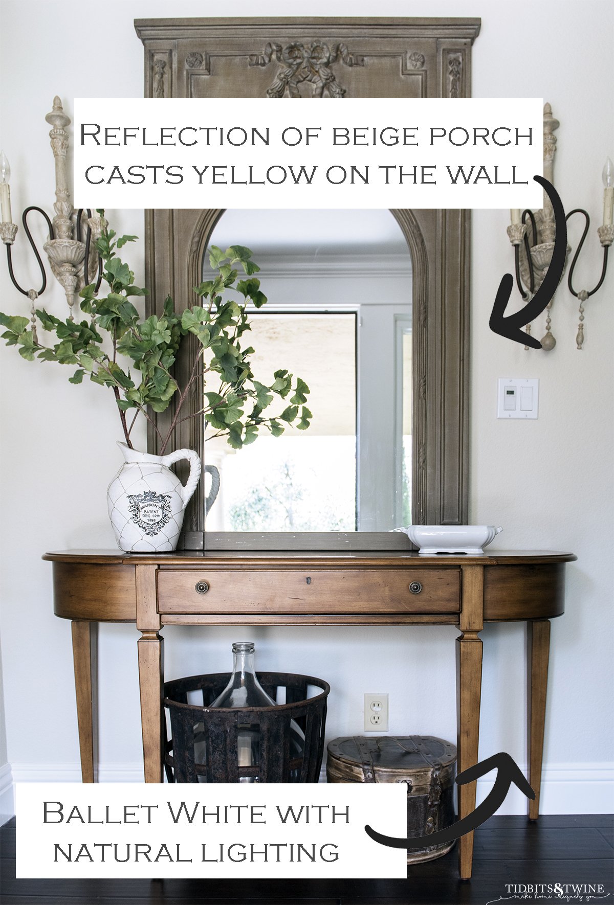
Keep in mind that light-colored walls can pick up reflected colors from their surroundings. Here’s a great example from my foyer. When I open the front door, the color of my porch reflects onto the Ballet White walls, temporarily changing how they appear!
It’s a good reminder that the lighting and surrounding colors in your home can make a big difference in how a paint color looks.
What Are the Undertones of Benjamin Moore Ballet White?
One of the biggest challenges I had when choosing an off-white was finding one that didn’t flash yellow, pink, or green. So many of the colors I sampled looked beautiful on a paint chip but completely different once they were on my walls!
Ballet White has warm, muted yellow undertones, but they’re softened enough that the color reads more like a creamy beige than a traditional yellow-based cream.
In my south-facing living room, Ballet White looks like a warm cream or light beige. In my north-facing family room, it takes on a softer, slightly greige appearance. I’ve never noticed it looking distinctly yellow, pink, or green in my home. It’s just a creamy neutral!
Now, I will say that any paint with a high LRV is susceptible to surrounding colors. That said, some people do notice a subtle green undertone in Ballet White, depending on their lighting and surrounding finishes. It’s a good reminder that the same paint color can look surprisingly different from one home to another.

Tip: If you find yourself having trouble identifing pesky undertones that might be present, here’s a helpful guide for How to Identify Undertones.
Ballet White in a South-Facing Room
South-facing rooms generally receive more direct sunlight throughout the day, giving them warmer, brighter natural light than north-facing rooms. This can bring out the yellow undertones in warm paint colors.
My living room faces south, so I was concerned that Ballet White might look too yellow. But even with all that warm light, Ballet White remains a beautiful creamy neutral without looking noticeably yellow.

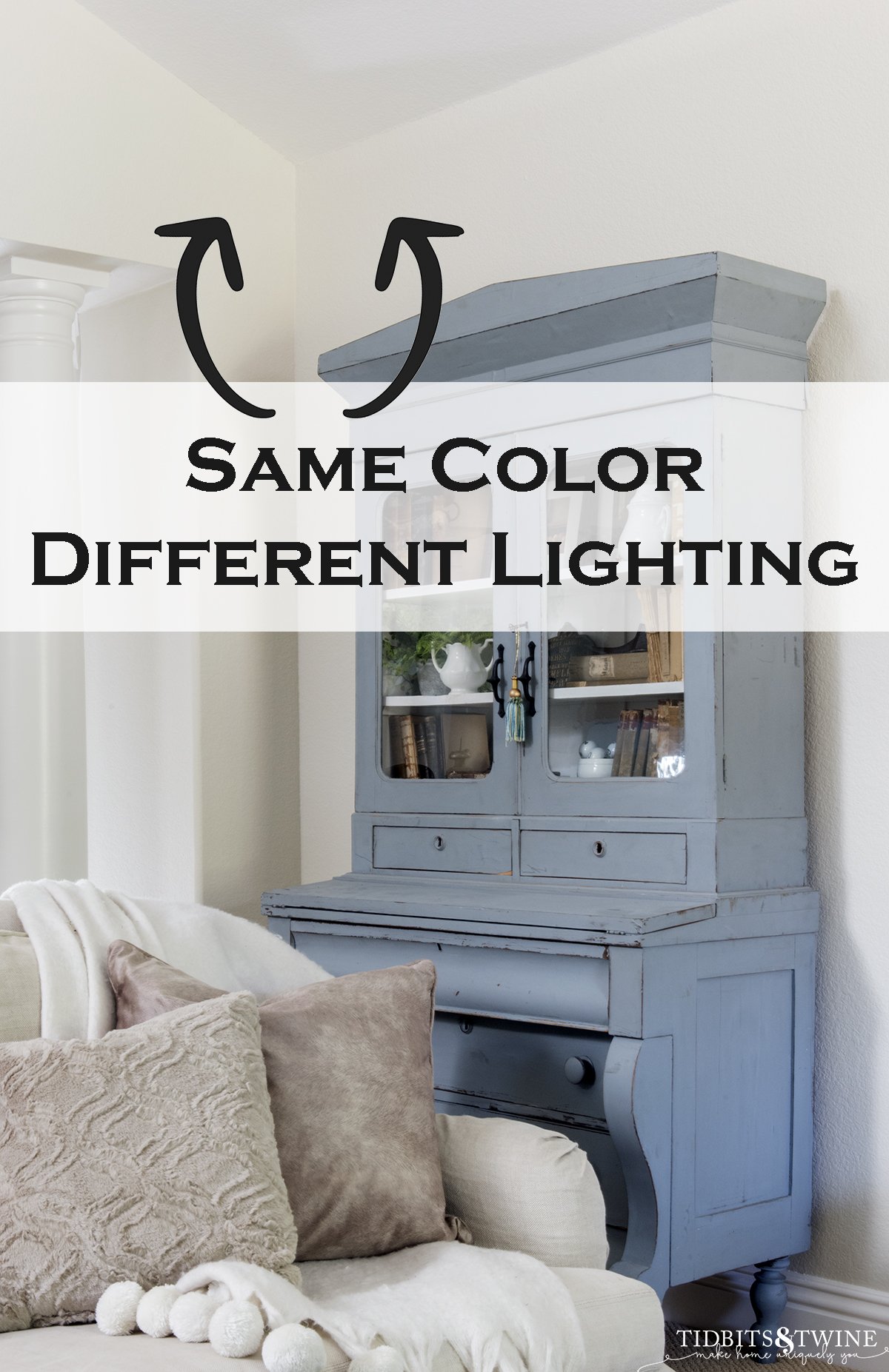
In the photo below, notice how the wall on the left looks a little creamier. This wall directly faces a south-facing window, so it picks up more of that warm sunlight.
It’s a good example of how the same paint color can look different from one wall to another depending on the light.
Ballet White with Southern and Eastern Light
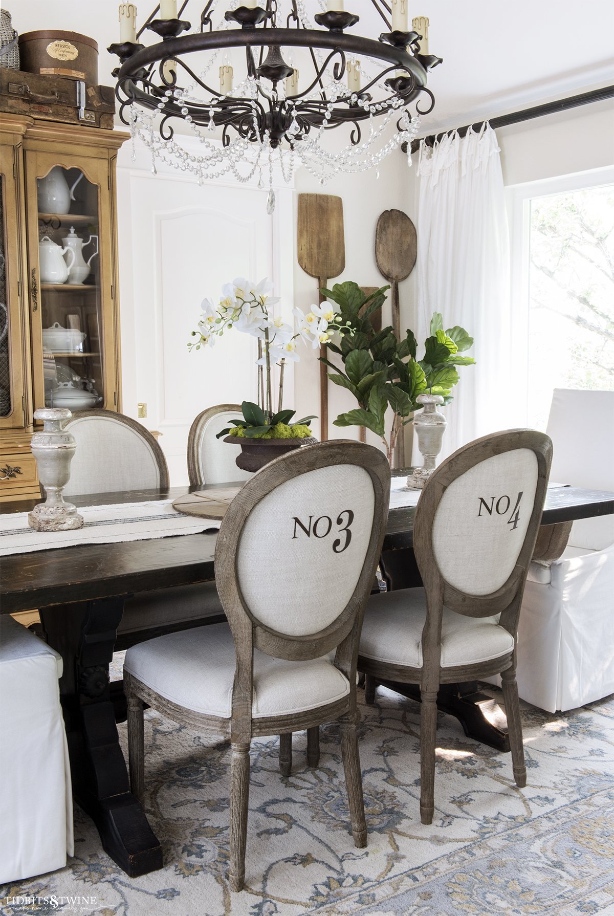
My dining room gets natural light from both the south and east. Eastern exposure brings direct morning sunlight, while southern exposure provides warmer, brighter light throughout much of the day.
With this combination of light, Ballet White looks more like a soft, warm beige in my dining room. I especially love how it complements the natural wood tones of my furniture.

Ballet White in a North-Facing Room
North-facing rooms generally receive cooler, more indirect natural light, which can make warm paint colors appear grayer and sometimes bring out subtle green undertones.
My family room receives light from both the north and west, so the color changes throughout the day. Compared with my south-facing living room, Ballet White looks more like a soft greige than a creamy beige in this space.
What I love is that it still maintains its warmth, even in the cooler light. It never looks cold or dingy, which was one of my biggest concerns when choosing a paint color for the entire house.

Ballet White in a North-Facing Kitchen
My kitchen also faces north, so it receives cooler, more indirect natural light. Normally, this can make warm paint colors appear a little grayer, but the warm tones of my travertine backsplash and dark granite countertops help balance the cooler light.
Ballet White maintains its creamy warmth in this space, complementing the travertine without looking too yellow or clashing with the darker countertops.
Since I wanted one paint color throughout my home, Ballet White was a great compromise. It might not be the first color I’d choose specifically to coordinate with travertine, but it works beautifully with the finishes I already have.

Ballet White in a Dark Hallway
No light? No problem.
Hallways can be tricky when choosing paint colors, especially when they receive very little natural light. Without enough light, some off-whites can look dull, dingy, or grayer than expected.
My downstairs hallway gets almost no natural light, so I was concerned that Ballet White might look muddy or too dark. But surprisingly, it maintains its soft, creamy warmth even in this low-light space.
It doesn’t look quite as light and bright as it does in my south-facing living room, but it still feels warm and inviting.
If you’re considering Ballet White for a dark hallway, be sure to test it under your actual lighting, including any lamps or overhead fixtures you use in the evening.

What Trim and Ceiling Colors Go with Ballet White?
My trim is painted Kelly-Moore Swiss Coffee, a soft, warm white that provides a subtle contrast with Ballet White without looking too stark. Unfortunately, Kelly-Moore closed in 2024, and Benjamin Moore’s Swiss Coffee is a different color, so don’t assume the two are interchangeable!
If you’re choosing trim colors for Benjamin Moore Ballet White, here are three options worth considering:
- Benjamin Moore White Dove (OC-17): A great choice if you want a soft, warm white that creates a gentle contrast with Ballet White.
- Benjamin Moore Simply White (OC-117): A brighter white with a touch of warmth, offering a little more contrast without looking too stark.
- Benjamin Moore Chantilly Lace (OC-65): A crisp, clean white that creates a more noticeable contrast for a brighter, fresher look.
The key is choosing a trim color that provides enough contrast while complementing Ballet White’s warmth. Be sure to sample the colors side by side in your own lighting before making a final decision.
Tip: Want to try Ballet White in your own home? Here’s a guide I put together for The Best Way to Test Paint Colors.
Ballet White Alternatives
If you love the warmth of Benjamin Moore Ballet White but it isn’t quite right for your home, there are two similar colors worth sampling.
- Sherwin-Williams White Duck (SW 7010): A warm off-white that’s slightly lighter and more muted than Ballet White. If you want a similar look with a little less warmth, White Duck is worth sampling.
- Farrow & Ball School House White (No. 291): Another beautiful warm neutral with a slightly deeper, more subdued appearance. It has a soft, understated quality that makes it a good alternative if Ballet White feels a little too creamy.
- Benjamin Moore Winds Breath (OC-24): Another warm neutral I considered for my home. Wind’s Breath has slightly more depth and leans a bit more toward taupe or greige than Ballet White. It’s a great option if you love Ballet White but want something a little more muted.
- Benjamin Moore Natural Cream (OC-14): If you love Ballet White but want something a little deeper, Natural Cream is worth considering. It’s a warm greige with soft taupe undertones and noticeably more depth than Ballet White. It’s also a beautiful color to sample for kitchen cabinetry.
All three shades are worth sampling if Ballet White isn’t quite right for your home. Small differences in undertones and depth can make a big difference once they’re on your walls.
Related: You can also explore my 8 Favorite Warm White Paint Colors for more options I considered when choosing a whole-house color.
When Should You Avoid Benjamin Moore Ballet White?
As much as I love Ballet White, it isn’t the right choice for every home!
If you’re looking for a stark white with a crisp, clean appearance, Ballet White probably isn’t for you. Its creamy warmth and beige undertones give it more depth than a true white.
I’d also be cautious using it alongside very cool finishes or in rooms where the lighting brings out more yellow or green than you’d like.
My advice? Sample Ballet White next to your existing flooring, countertops, and trim before committing. A color that looks beautifully neutral in one home might look quite different in another.
More Paint Color Help
Still trying to find the right paint color for your home? Here are a few other guides that might help!
- The Best White Paint Colors — See the other colors I considered before choosing Ballet White.
- The Best Way to Test Paint Colors — Learn how to test colors in different lighting before committing.
- How to Identify Paint Undertones — Understand why a color sometimes looks yellow, pink, or green once it’s on your walls.

I am currently painting my kitchen cabinets Ballet White and am desperate for a complimentary wall color. I was opting for Alabaster, but it’s looking too yellow. I am actually shying away from stark white walls, so I may need something very similar to Ballet White. I would love a few suggestions to get me started. I have lots of dark brown trim in my home (built in 2008). Thanks!!
Hi Michelle – Ballet White has a warm undertone, so to be complementary, look for something with a warm undertone. For lighter walls, try White Dove (popular), Cloud White Simply White or Chantilly Lace. For darker walls, try London Fog, Pashmina, Smokey Taupe, or Stone Hearth, all of which are neutrals. Remember the lighting in your home (natural and artificial) will greatly affect how each of these colors look in your space, so you’ll have to try out a few different ones to find the best fit for you. Good luck with your project!
I love the Ballet White paint color for my home, I am painting my kitchen cabinets white and do not want it to clash. What color are your kitchen cabinets?
Very well done blog on the effect of lighting on the colour of this paint. I have used Ballet White in my hallway and an office. With Cloud White trim I am happy with the results. I was debating using it in my south facing living room that is made dark by a large spruce tree and this article has convinced me to use this colour due to its versatility with different furniture and fixtures. Thank you.
Hi
Can you tell me where you bought that beautiful entryway console? I’m looking for same wood tone and Can o my find darker/redder or more ashy
Thank you!!!
Hi Monica! So sorry for the delay. I found it at a consignment shop. I can’t find any brand info on it to share with you – so sorry!
Hi Kim, thanks for your article. I couldn’t agree more!
I discovered BM Ballet White 10+ years ago for my living room and I still love it. I love how the wall color transitions throughout the day and changes with each season. It’s as if I have all these beautiful neutrals in one paint color. I gradually repainted each room to Ballet White and I enjoy how each angle brings out a different neutral and how they compliment each other. My house decor is fairly minimal and try and avoid repainting whenever possible. It was important that I choose something I would be happy with for many, many years and I’ve found that in Ballet White. There’s a lot of trim in my home (built in 1929) and I choose BM Cotton Balls. I’ve been using this color combination since I first started in my living room and I haven’t tired of it yet.
I’m painting my colonial exterior ballet white. I LOVE how your blue/gray armoire compliments it. What color did you paint it? Beautiful job.
Hi Shana! I actually bought that cabinet already painted like that so I’m not sure of the color. I’m sorry I couldn’t be more help!
:) Kim
Are you slipcover couches pottery barn? I’ve been looking for a white paint to go with my PB slipcovered sofa that is very creamy and some white paint make the sofa appear dingy yellow.
I just love the blog, i think white is a pure colour and these white are just amazing, really awesome, thanks for share.
I’m getting ready to paint a new-to-me house and this is perfect. I love white but not one that’s too cool or too warm, I want “just right” and this sounds ideal. Thanks for researching. I’ll check it out.
Thank you, Kim.
Karen
Kim, Did you paint the numbers on the back of your dining chairs? If so, could you tell me where you got the stencil and what type of paint did you use?
Thank you so much!
Deborah D.