The design rules you should never break if you want to avoid costly mistakes! These rules are there for a reason and will help you achieve the perfect balance in your home.
Mistakes happen. Even to the professionals! But sometimes, knowing the design rules will help you avoid those mistakes.
I realize I seem like I’m contradicting myself. I usually tell you there are no “rules” and that they’re just guidelines that you’re free to break!
Well, not in these cases...
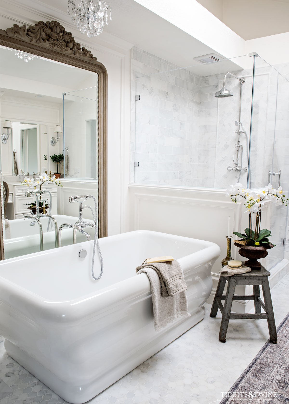
These are rules that if you follow, you’ll find that your home will feel more harmonious. Because no one wants to have regrets, right? Or to feel like something is just “off”. The design rules below will help you get it right the first time!
I’ve been sharing style guides and design tips with you for some time now. My goal is to take some of the work and stress out of decorating so that you can relax and enjoy the fun part!
Below you’ll find some handy design rules that are there for a reason. The ones you should never break! Use the Table of Contents below to quickly navigate this article.
1. Create Conversational Groupings
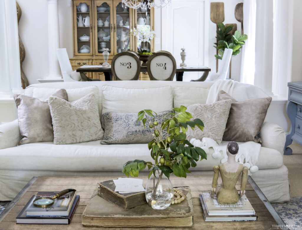
Have you ever sat down in someone’s home only to feel like you’re having to shout at them across the room? Or worse yet, you’re sitting so close that your knees almost touch!
Furniture should be arranged to create conversational groupings. This means you should NEVER put all of the furniture lined up against the walls. While you might think that leaving as much space as possible in the center of the room will make the space look bigger, it actually makes the room look smaller!
Why? Because pushed against the walls, the furniture mimics the shape of the room and so puts the focus on the shape of the room instead of the beauty of the furnishings. Also, the room will often look crowded on the perimeter and empty in the middle, which jars the eye. It will be just a plain box of a room instead of a space with interest and dimension.
As an alternative, pull furniture away from the walls and create more intimate conversational groupings. If the room truly is small and it’s necessary to put the sofa on the wall, move it at least 2-3 inches away just so that a shadow will be created, which will add just a bit of dimension to the space.
Here are some general spacing guidelines for a living room:
- Amount of space for a walkway: 26″-36″
- Distance between chairs: 4″-12″ or the distance of an accent table
- Distance between furniture and coffee table: 14″-18″ (within arm’s reach)
2. Use the Proper Scale for Furniture & Rugs
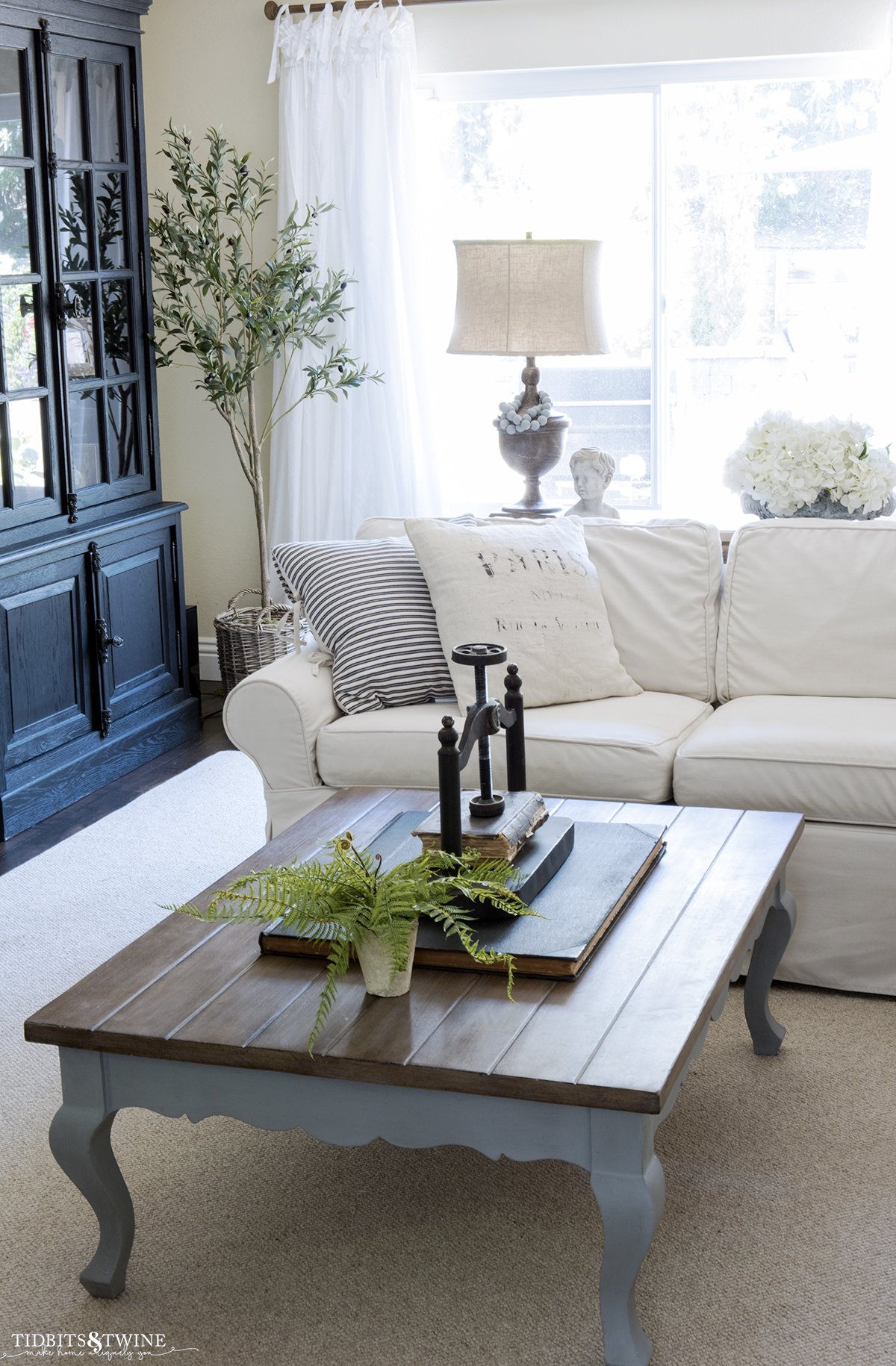
In the world of interior design, “scale” refers to the size of an object in relation to the size of the room, as well as to the size of other objects in a room. Scale doesn’t just refer to measurements, but also the visual weight of varying objects.
Furniture Scale
A common mistake is to purchase furnishings and decor that are either too big or too small for the room. If furnishings are too big for a room, they look as if they are overpowering the space. If they are too small, it will look as if the room is eating them up.
In general, big rooms can handle bigger furniture, smaller rooms need small pieces.
For small rooms, look for more streamlined furniture items that don’t take up precious space. Large roll-arm sofas are comfortable, but the wide armrests can take up valuable space in a tight area.
Rug Scale
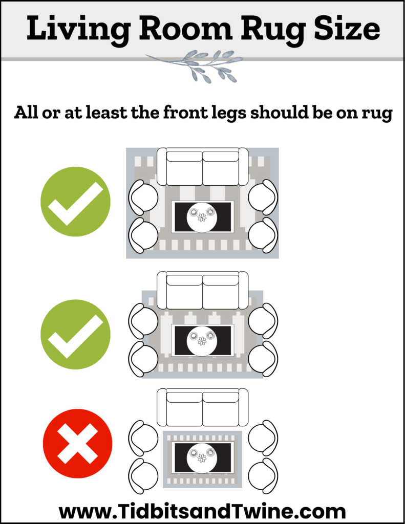
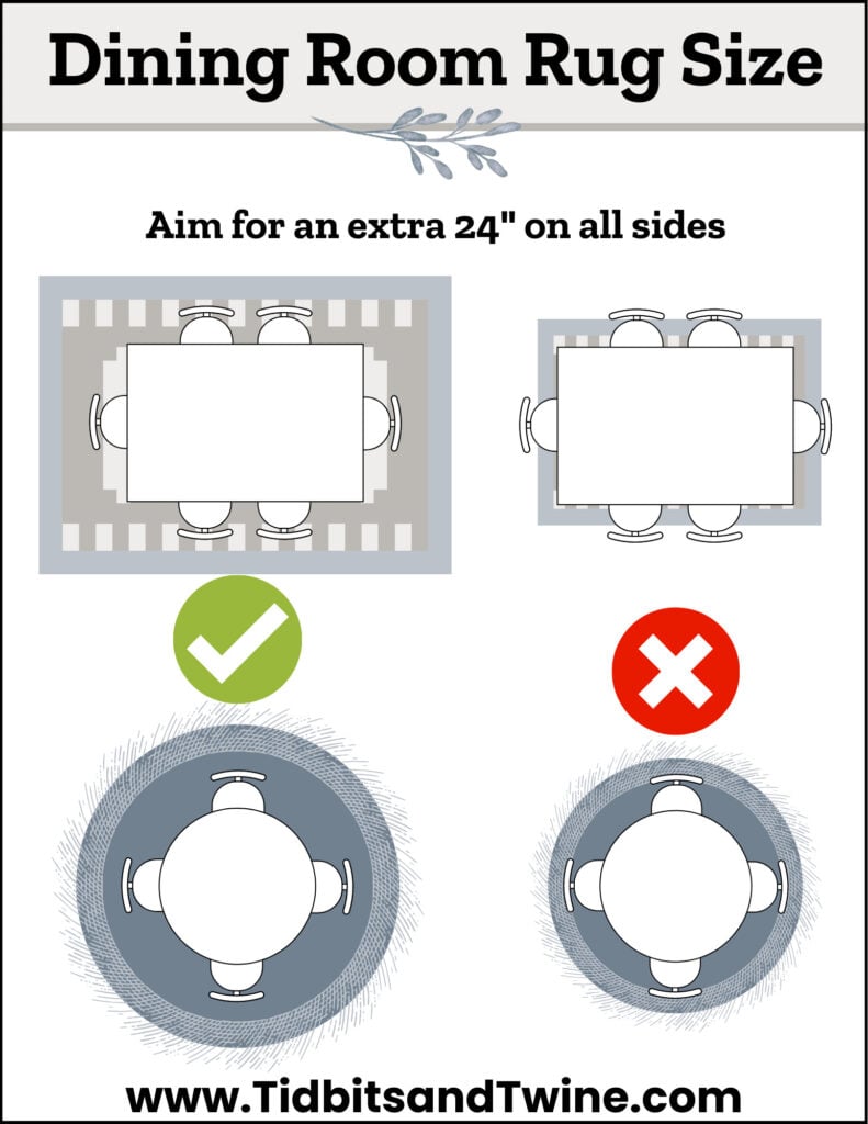
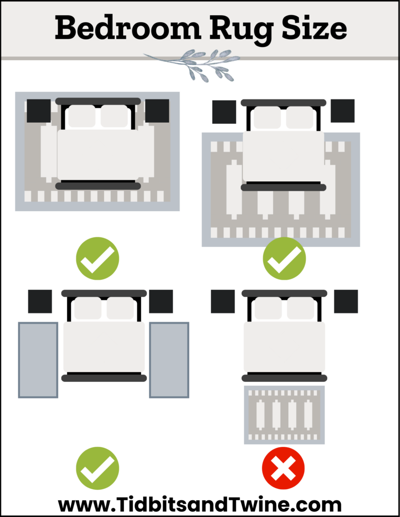
The same is true for an area rug! Ideally, you want a rug that is just right. Not too small and not too big.
Hello Goldilocks!!!
Why is the size important? Well, a rug that is too big for the space looks a bit like it’s eating the furniture. And a rug that’s too small feels awkward and doesn’t actually do its job of defining a space (unless you plan to layer your smaller rug over a properly sized one).
Aim for a rug that is properly scaled to fit both your room and your furnishings!
You can find more information on exactly what size rug for every room in my Guide: How to Choose a Rug
3. Window Treatments
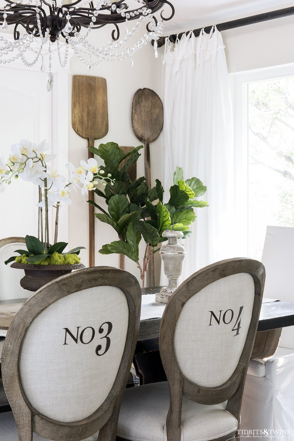
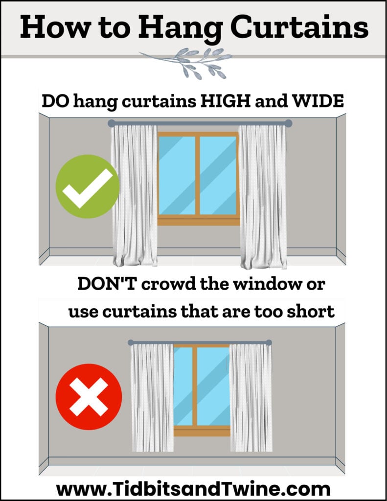
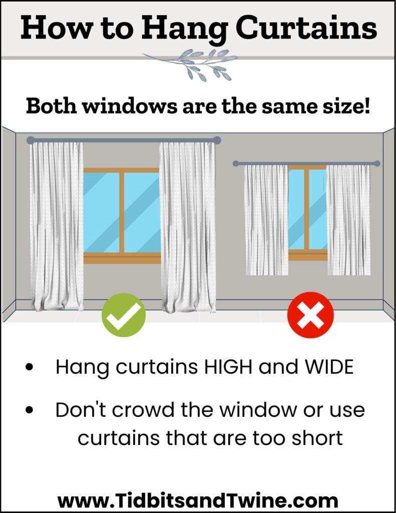
Have you ever wanted to make your windows look bigger? Here are some measurements to tell you what length curtains you need, how high to hang your curtains, what fullness you need, and more!
- Curtain width should always be at least 2x the width of the window for fullness. For modern rooms, just twice the window’s width or even just 1 ¾ times for a really sleek look (if you’re using multiple panels, purchase an even number of panels that equals at least twice your window’s width for fullness)
- Extend the curtain rod by at least 8” past the outer edge of the trim on each side of the window. The wider your panels, the further you’ll need to extend your rod.
- Mount your brackets so that when closed, your curtains just cover your window casing but not the glass.
- I like to extend my rod beyond my bracket by about 2″ when space allows.
- For standard ceilings, hang curtains as close to the ceiling line as possible (just below the crown molding) to help elongate the window. For taller ceilings, hang the rod 2/3 of the distance between the top of the window and the ceiling.
- If you want your curtains to skim the floor, they should hang no more than 1/2″ above the floor. Any more and they’ll look too short.
- For a puddle look, add anywhere from 2″-8″ to the length
- Choose a Curtain Top that fits your design aesthetic for cohesiveness
4. Use Multiple Sources of Lighting
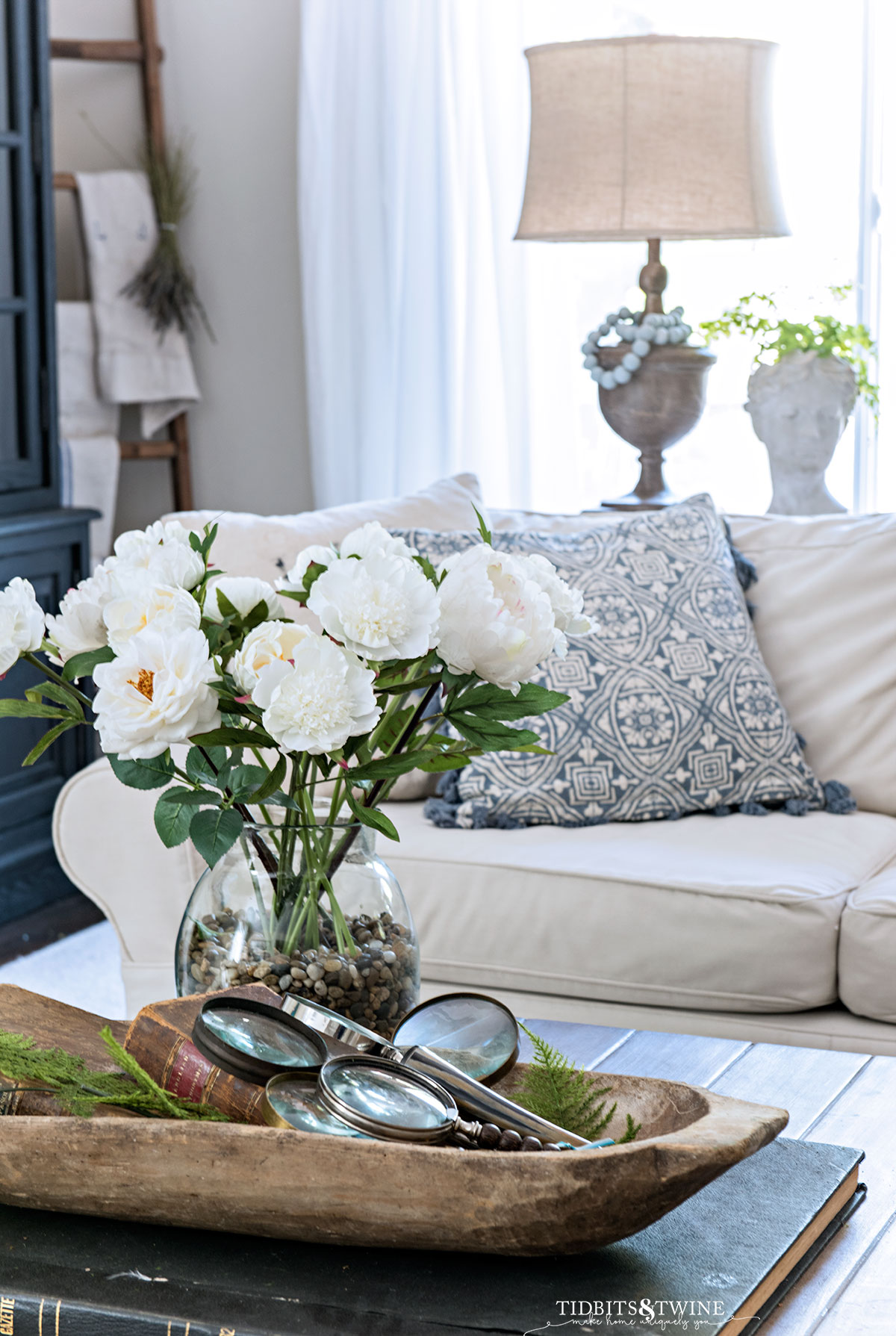
Overhead lighting does a good job lighting providing overall light, but it should never be the sole source of light in a room. Overhead lighting is often unflattering and not even throughout the room, leaving some corners and focal points in the dark.
In addition to overhead lighting, add floor lamps, table lamps, and even sconces if possible. Multiple light sources not only help create an evenly lit room, but make a space feel warm and inviting. Additionally, they help to add a layer of depth to the space that overhead lighting alone just can’t achieve.
Use task lamps in work areas, spotlights on artwork or other focal areas like a fireplace, table lamps for color and be sure your overhead lights are on a dimmer switch.
Wondering how high to hang your sconces? Check out my Guide to Sconce Height for Every Room
5. Include Something Organic
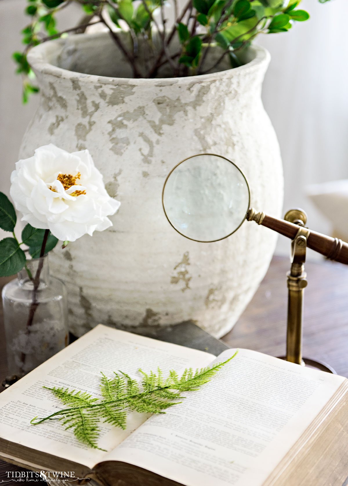
Often, homeowners forget the importance of organic items. Plants and flowers are a detail that while often overlooked, make a home feel more inviting and complete. Organic items help to blur the line between outdoors so that the space doesn’t feel completely manufactured.
Read more about my Favorite Faux Flowers and Fake Plants that Look Real
Fresh flowers or live plants are ideal, but not everyone has a green thumb. Truthfully, anything organic will make an impact. Alternatives include preserved boxwood, branches, feathers, seashells, wood, moss, aged paper, and even candlelight can all help to make a space feel natural and homey.
Also, there are a lot of great faux plants on the market now and sometimes, it’s hard to tell the difference!
The goal is to bring in an organic shape and texture.
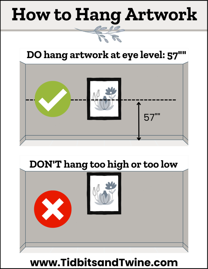
6. Hanging Art at the Right Height
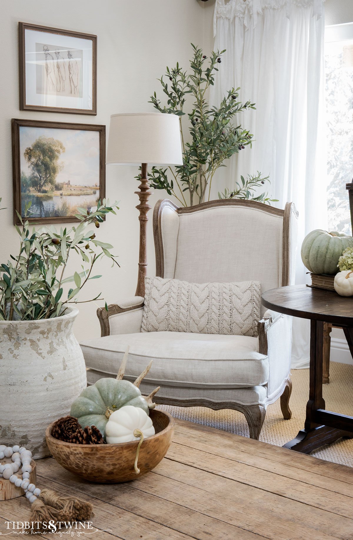
Before you put that nail in the wall, measure first! A good rule of thumb is to hang the center of the artwork at 57″ from the ground. This is true whether you’re hanging a single piece of art, a series, or even a gallery wall. In the case of a gallery wall, the center of the grouping would be hung at 57″.
The exception to this rule is if you have high ceilings where the standard eye-level looks too low. If you have higher ceilings, adjust up to 63″. Avoid going any tall so that your art doesn’t feel disconnected from your furnishings.
Join the Community
Let’s keep in touch! Get exclusive artwork plus the latest news delivered directly to your Inbox!


