Decorating with neutrals can be beautiful, with a little planning. Here’s how to keep your neutral decor from being boring!
There are those that think neutrals are B-O-R-I-N-G! They think the lack of color means that no thought or effort went into decorating. Or perhaps they think neutral rooms are just plain uninteresting.
I’m here to tell you…those people are WRONG!
Okay, yes some neutral rooms look like you just moved into a nice apartment white space and plunked some furniture down with no thought. Some might look boring or uninspired or like they haven’t started decorating yet. But that’s not the look we’re going for! And I’m about to tell you have to keep that from happening!
When my husband and I first got married, I picked out a green tufted sofa with nailhead trim. I loved that sofa…until I didn’t. Eventually, I realized that green wasn’t “my” color but now I was stuck!
Since then, I’ve come to realize the beauty of decorating with neutrals. When it comes to my home, I am not good at commitment. I get bored and like to change things up and move things around from room to room as I shop my house and neutrals allow me to change my mind a lot about my color du-jour.
So for those skeptical about decorating with neutrals, I’m here to tell you that a neutral space can look timeless and sophisticated. Frankly, they are downright beautiful! They are soothing, calming, and a great backdrop to really highlight your style.
The key to a beautiful neutral room is PLANNING! Yes, instead of being effortless, a neutral room actually takes some effort to pull off a gorgeous look. Neutral rooms require a variety of textures, wood tones, metallic finishes, and patterns to help give the room depth in the absence of color. Add in a few plants and colorful accessories and you’re set!
So without further ado, here are 7 tips to perfectly style a neutral room.
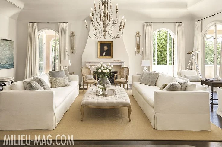
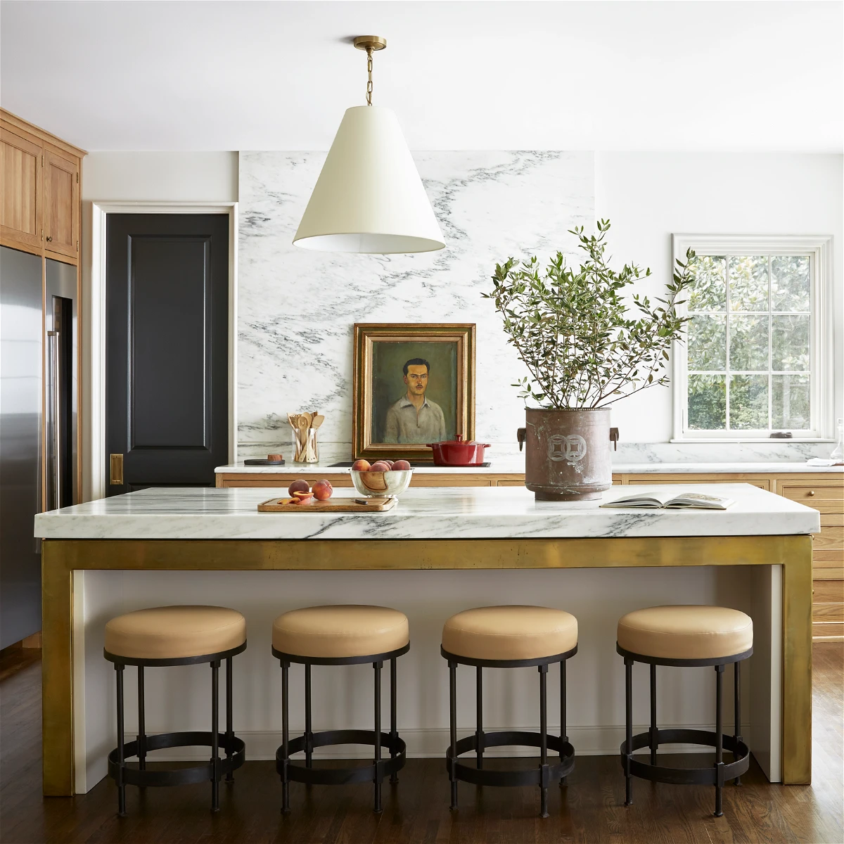
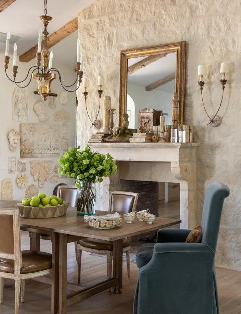
1. Vary Your Neutral Palette
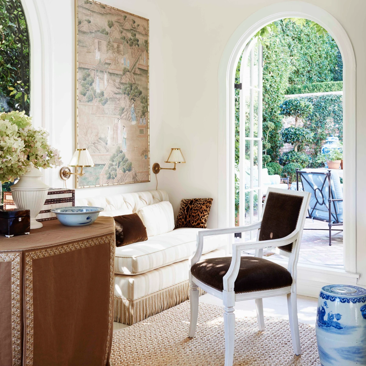
Timeless and versatile neutrals include whites, beiges, greys, browns, and yes, even black!
But don’t just pick one shade and stick with it! In this room designed by Sean Anderson, you’ll notice that the walls are a nice warm white as a beautiful backdrop to everything else. There’s a mix of beige and gray in the textiles and a pop of white in the dining table. The brown woods run everywhere from light, like int he beans, to deep rich in the lighting. It’s the mix of neutrals that makes such a visually interesting space.
And then to ground the entire space, that amazing black coffee table! Black will always be a classic in decorating, but remember, a little touch of black goes a long way.
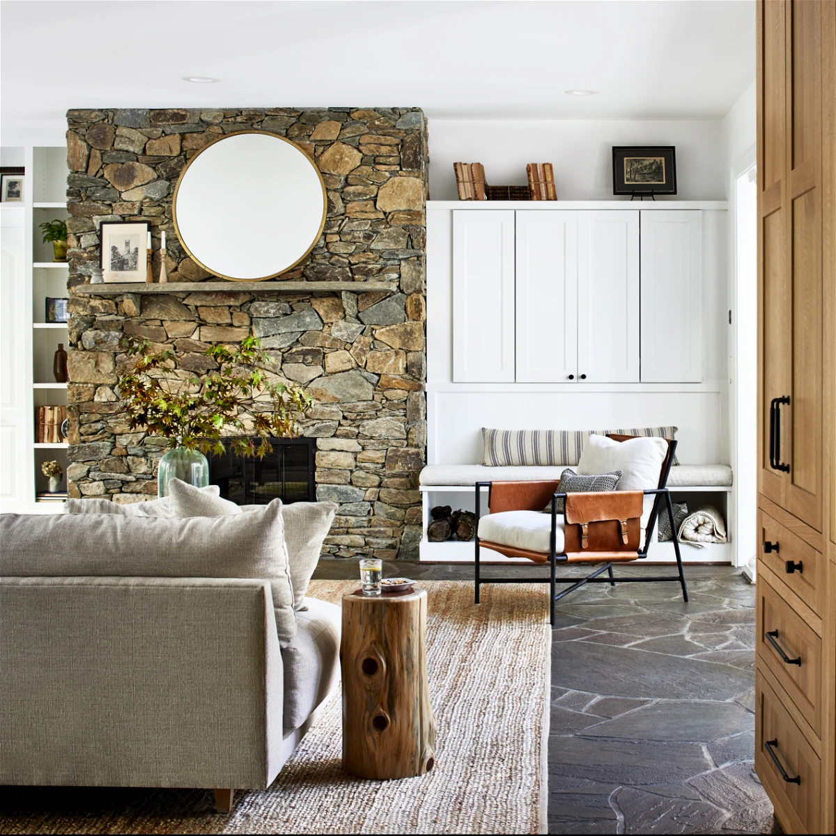
2. Add Tons of Texture
Texture in a space is important because it adds dimension and allows elements to play off of one another. This is especially true in a monochromatic room where textures play an important role in keeping the room from looking flat and sterile.
Depending on your particular decorating style, you’ll gravitate toward some textures more than others. For example, a cozy room can be created through the use of plush fabrics, wood, natural fibers, and woven materials (think organic). On the other hand, if you want a clean, sleek look, consider using metallics, glass, and lacquer.
3. Incorporate Metallics
Metallic accents such as gold, silver, or copper can add a touch of glamour to your neutral decor. But perhaps more importantly, they add some contrast! And just like your color palette, you don’t have to stick with just one metallic! You can absolutely mix and match metals in a space! Considering using metallic accessories such as lamps, vases, or picture frames.
4. Use Natural Elements
No one creates art as beautiful as Mother Nature! I am a HUGE believer that incorporating organic (aka natural) elements into a space is really a game-changer. Don’t believe me? Look at this Before & After.
Luckily, natural elements have been trending for a few years and are easy to find when out shopping. You really can’t go wrong whether it’s a gorgeous petrified wood dish, a marble fluted bowl, a sisal rug, a great linen slipcovered sofa, or even just some wood end tables!
Natural elements add a nice organic shape along with tons of texture that just can’t be recreated in man-made elements. Plus, each one is unique and helps to keep your space from looking like a sterile showroom!
Organic elements include small plants, dried arrangements, succulents, seashells, flowers, feathers, preserved plants, or even heavily aged paper on books! You can include them in standard pots or vases, but it’s also an opportunity to use a unique bowl or vessel so that you’re displaying two things in one. For example, preserved moss in an antique ironstone bowl!
5. Don’t Forget the Pattern
Pattern, even if it is neutral, helps to create visual interest. But pattern doesn’t have to mean anything crazy! You can try trellis, toile, ticking, buffalo check, stripes, etc. within the same neutral palette of your room. Even a herringbone floor or subway zellige backsplash has a pattern!
6. Add color in Accessories
With a neutral backdrop, you can always add in some color should you choose. Accessories like pillows, art, or even throws are easy ways to incorporate color. These colors can be used to create focal points, or just to liven things up a bit.
7. Include something unexpected
Want to know how to really make a space interesting? Add something unexpected! This could be an unexpected print, like the rug below. Or perhaps something oversized that really makes a statement! This is also why I like to use antiques because they can often be unexpected finds on bookshelves and more.
Remember, decorating with neutrals doesn’t have to be dull. Use these tips to create a cozy and stylish space that will stand the test of time.
More Decorating Tips
- How to Add Color to a Neutral Palette
- How to Achieve a Timeless Interior Design Style
- Adding Texture to Your Home {8 Easy Ways}
- How to Pull a Room Together

Join the Community
Let’s keep in touch! Get exclusive artwork plus the latest news delivered directly to your Inbox!
The first time I saw a white / neutral room, I fell in love! That was over 20 years ago and I never lost my love for the serenity and simplicity of pale, neutral interiors. And in each home I have owned over the years, I re-created that lovely neutral palette. In our current home I decorated my formal living room with soft butter cream painted walls, white trim, natural wood floors, and greige linen upholstery. Add to that generously billowy white sheer curtains, a glass coffee table, brass and wicker accents, and a stone hearth. Neutral, yes. But definitely anything but boring!
Lynn – Your home sounds lovely!
I read one of your other blogs about the steal for Serena & Lily and now I can’t find the link. Can you resend as there were so many good ideas and you had a great throw blanket. Thanks.
Hi Lambi! I’m glad you liked that article! Here you go: https://www.tidbitsandtwine.com/serena-and-lily-dupes/
I appreciate the neutral look, and I enjoy seeing the style, but my favorite color is red. I tried to go neutral, but when I tried it, I noticed I only made it a week. I wanted color and added back in red, green, and blue, but in touches and accents, not a bold look. I do have all white walls and a tan sofa. In the bedroom, I have yellow, green, pink, and white. I think my style is cottage style, and though it is not crazy splashes of color and clashing, it IS eclectic and not symmetrical everywhere. I am not messy with the decor or garish. I don’t like that. I just couldn’t stick to neutral, even though it was pretty and easy to do. I missed the colorful accents too much!
For me, gray is a neutral. Beautiful spaces.
Thanks for this informative piece.
This post showcases my exact style when interior designing. I love the tranquility and romantic feel that neutral colors bring to a traditional and contemporary room with the incorporation of rustic/vintage and antique accessories- it’s my fav! All of these images are very inspirational. Thanks for sharing, Kim. You have great taste! :)
I’m in LOVE with neutrals. I agree with you 100%. Gorgeous inspiration photos.
Hugs,
Jamie
Hi Jamie – Thank you so much and thanks for stopping by and taking the time to leave a comment! :) Kim
Kim,
I’ve been waiting for your chandelier post since your mentioned it a few days ago. Fabulous!!!
I can’t wait to try it!
Janet
Hi Janet – I’m so glad you liked it! Let me know how your project goes! :)
I love the neutrals in your pictures, but recently I posted a post about going more dramatic with black walls! The pictures I used had lots of windows with trim, white furniture, and beautiful black walls.
Sounds very dramatic! I’ll have to check it out!
I’m with you! I have slowly been replacing all of the color in my house with textures and patterns in neutrals. It is fun to add pops of color with the seasons and holidays, but overall the neutral scheme is very classic. The photos you’ve shared are beautiful examples of this look. Love it!
“Classic” is a great word for it! I agree!
I think I change my mind on color as the seasons change. I had done away with all the red when we lived in CA and had none, THEN I “thought” I wanted to add bits and pieces for a French Country look. So, I painted a wall red in the dining room. Guess what? I hate it. I am in love with the neutral palette with some black. All of your photos are great inspirations! Hubby ain’t gonna be happy that I want to paint it over so I’ll wait till he has a project out of town (he likes to come home for lunch). He’ll get over it. :)
Amber – Your comments always make me smile! It sounds like you’re enjoying and embracing the process of change…and dragging hubby along for the ride! My husband and I are in the same boat. :)
Those pix are all so beautiful and calming you may make me a “neutral” love. Thanks for pinning them and sharing.
I’m so glad you liked the photos!!
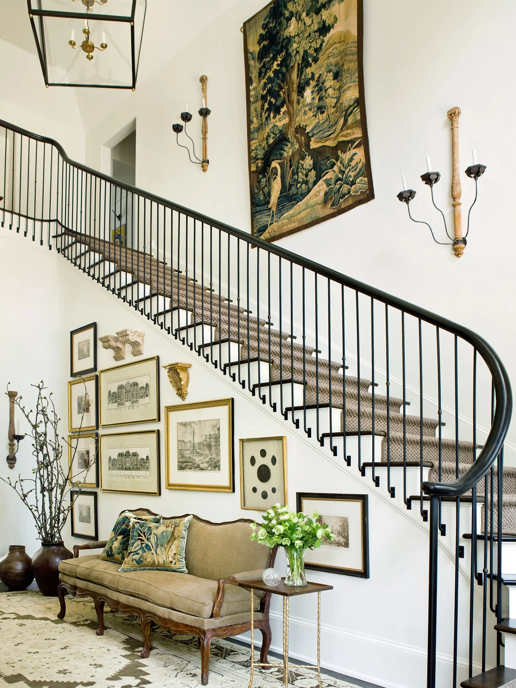
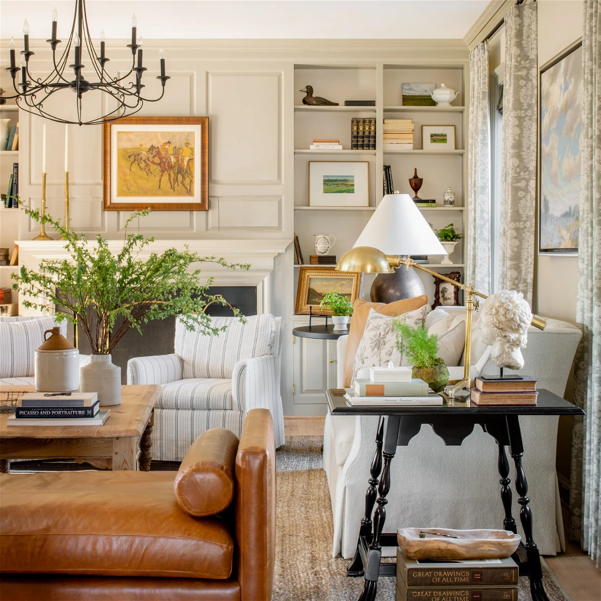
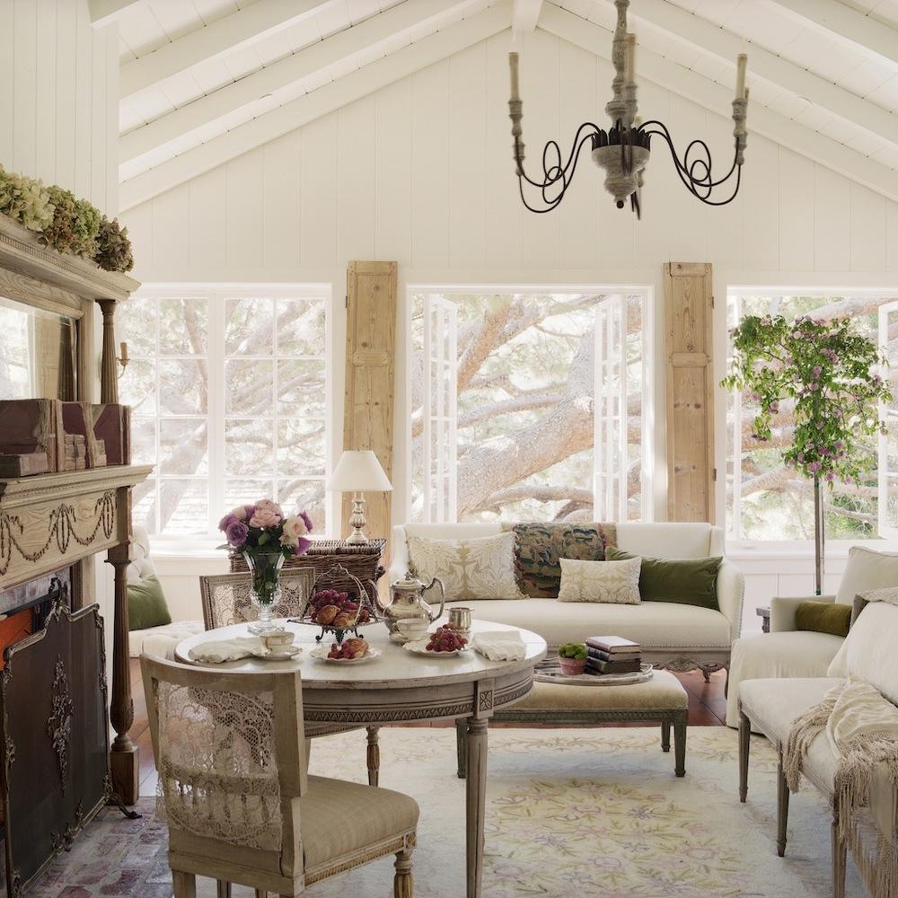
Such pretty rooms. I think the bottom image is my favorite.
Karen
That is an amazing room, isn’t it?! I love those doors…and that clock!