
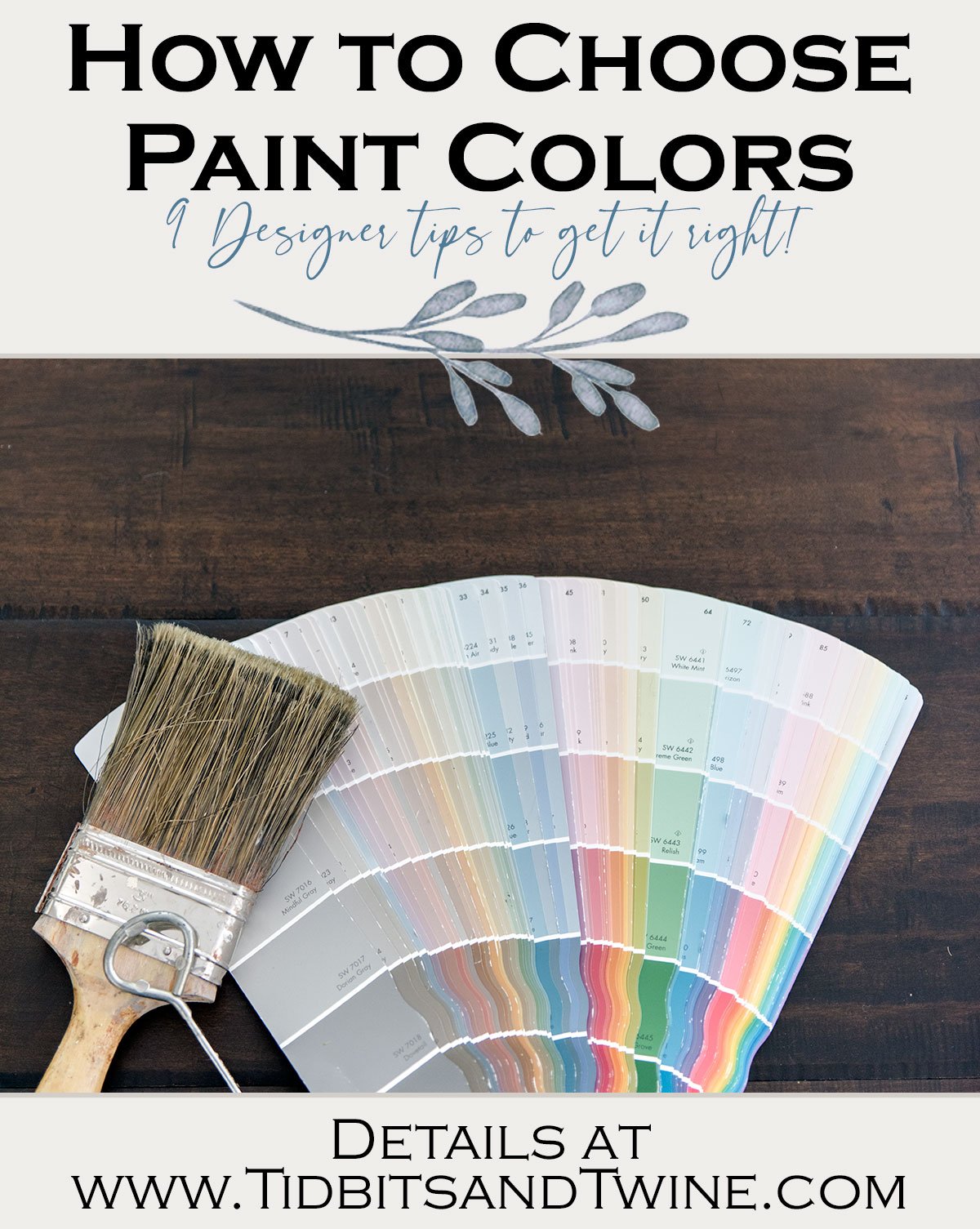
No one wants to make a costly painting mistake and with thousands of colors to choose from, the choices can be overwhelming! Here’s how to choose paint colors to get it right the first time around.
Painting interior walls is tricky. On the one hand, it’s just paint! If you don’t like it you can literally just paint over it.
But have you seen the price of paint lately! It’s so expensive! Not to mention if, like me, vaulted ceiling mean that you can’t easily paint the walls yourself and you have to hire a professional.
All that time and money means that while paint is an easy update, it’s still one you want to get right the first time.
But there’s no one right answer. What’s right for me might not be right for you. What a color consultant might tell you is their “go to” paint color, might not be right for your home.
So how do you find the right paint the first time around? Well, here are my tried-and-true tips.
Don’t choose paint first
This might seem counterintuitive to some. People think you should start with the biggest thing first and then figure out the rest, right? Well, not when it comes to paint.
There are thousands of paint colors to from, not to mention the ability to create custom colors. But good luck finding the perfect sofa upholstery to match the wall color you chose!
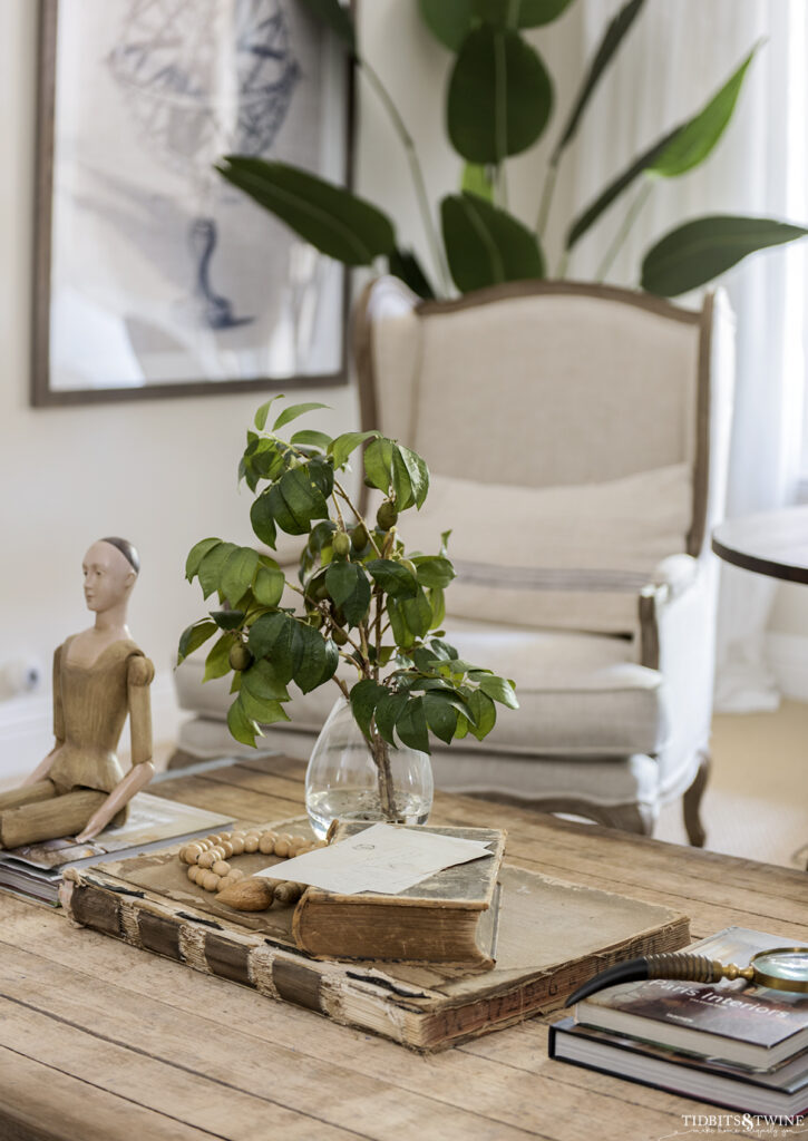
Given the limitless options, it’s easier to start with your other furnishings – those that have more limited color options – and then choose a paint color that will complement.
Instead of starting with paint and then discovering that your furnishings and wall decor doesn’t coordinate, leave paint toward the end. Once you have a color palette and desired feel in mind, you’ll be able to find a color that fits the bill.
So how do you find your color palette and feel? Well, that’s step 2.
Start with Your Inspiration
I’ve written before about my 4 Steps to the Design Process and specifically about How to Find Your Inspiration.
To find the perfect wall color for your home, refer to your inspiration item and pull colors from it. You want to look for colors that will complement what you own.
Because paint colors are affected by their surroundings, it is important to always pick your paint color last and have all of your items in the room when choosing a color.
Remember, you are not just choosing a color for a wall, but for an entire space.
Know What Mood You Want To Create
Color has the ability to affect mood, so before painting, take into consideration the type of space you are painting and what mood you want it to reflect. Moody and dramatic? Simple and clean? Fresh and fun? Every color evokes a different mood so you want your color choice to reflect your desired mood.
For example, blues, greens and neutrals tend to evoke feelings of calmness and relaxation and so are generally suited for bedrooms. Reds, yellows and oranges are more energetic colors that stimulate blood flow and so work well in kitchens.
One word of caution – some colors are so intense that they can be overstimulating or cause eye fatigue, so pay careful attention to the amount of saturation. You can read more about color psychology here.
Understand undertone
Understanding the undertones of colors is key! Every color is made up of a mass tone and an undertone. Mass tone is the immediately apparent color. Undertone is what is mixed with the mass tone. Undertones can be warm or cool. For warm paints, you might notice a red, orange, or yellow undertone. Cool paints might have a green, purple, or blue.
So why is undertone important? If you have a blue sofa with a green undertone, but pick a blue paint with a yellow undertone, you will instantly regret your choice! Just as a beige with a yellow undertone might not pair well with your white with a yellow undertone.
Say NO to mismatched undertones!
So before you select a paint color, figure out what undertones are in your room and select a paint with a similar undertone.
Not sure how to find the undertone? Here’s an easy guide!
Not sure how to find the undertone? Here’s an easy Guide to Find Undertone
Test Your Paint at home
Do not! I repeat, do not decide on your paint color at the store!
Testing paint at home on your walls is KEY! Not only will you want to see how the color works with your furnishings and decor, but you’ll also want to see how the lighting in your home affects how the paint looks.
Paint can look one way in one person’s home, and completely different in your own! There are a couple of big factors that affect how paint looks:
- Lighting
- LRV
- Natural Light
- Time of Day
South-facing rooms have a natural warmth to them. Colors with a high LRV may wash out a bit in this light and wall colors might appear a bit warmer in south-facing room. Choosing a cool paint for a south-facing room will balance out the warmth of the natural light.
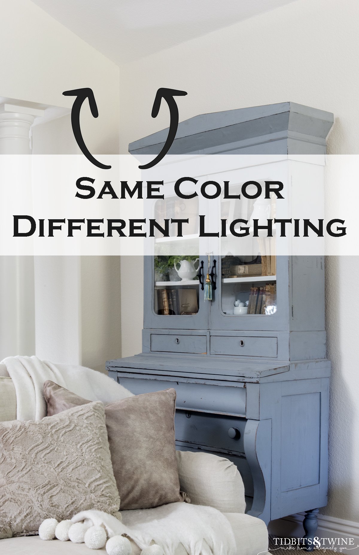
North-facing rooms, on the other hand, tend to naturally cast a cooler bluish light. North-facing rooms will accentuate the cool tones in a color.
Additionally, the LRV (of light reflectance value) will change how paint looks once it’s on the walls. The higher the LRV (closer to 100), the more that colors from surrounding objects will be cast on the wall.
A paint with an LRV of 75, let’s say, will have a green cast if there’s a lot of green outside the window. Or maybe pink if you have a red tile roof.
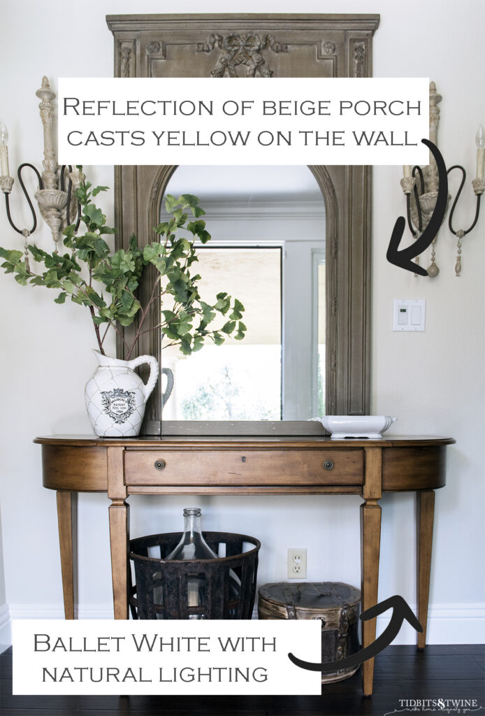
On the other hand, paint with an LRV less than 50 will soak up more light than it reflects and so will not reflect its surroundings the same as paint with a higher LRV.So why does this matter?
It matters because the ONLY way to know how a paint color will look in your home is to actually test it in your home….in the rooms you plan to use it.
Should you tape a swatch on the wall? Paint the wall? Learn the BEST Way to Test Paint Colors
Create Color Continuity
In order to create a harmonious environment in your home, use color continuity between all of the rooms even if the walls of different rooms are painted different colors.
For example, if your living room is blue and green, you can use blue and purple in the ding room, thereby creating a continuity of blue between the two rooms.
When Using More Than One Color, Don’t Play Fair
If you choose a color scheme using three colors, don’t use the colors evenly throughout your space. Instead, follow the 60/30/10 rule:
- 60% should be your main color
- 30% your secondary color and
- 10% your tertiary
As a practical example, think of your walls as your 60%, your furniture as your 30% and your accessories as your 10%. Alternatively, if you are using just two colors, use 66% as your primary and the remainder as your secondary color.
Look to the Future
Because painting can be expensive, it’s always best to consider how your paint color will look in 2 years, in 5 years, or even when you sell the house! In general, buyers dislike bright reds and yellows, so if you choose one of those paint colors, know that you might need to repaint before selling your home.
Some paint colors are trendy and you might regret your choice a few years down the line. This is why I generally suggest using a neutral paint color for walls. Neturals are not only “safe” choices for buyers, but they also allow your furnishings to take center stage! Plus, with a neutral backdrop, you can easily change the color of your accessories according to your mood or the season.

Know Your Sheens
Sheen doesn’t affect the way a color appears but does affect the amount of light that is reflected.
The higher the sheen, the more the light is reflected. Higher sheens also allow for better washability but tend to look institutional in a home (with the exception of kitchens and bathrooms) and will show imperfections more.
Each brand has its own sheens. For example, Benjamin Moore carries a matte, which is more washable than flat but not as shiny as eggshell.
My interior walls are heavily textured which is why I don’t like sheen on my walls. As such, I choose Matte if available, otherwise Eggshell.
In general, use the following guide:
- Flat: Used for ceilings and rooms where walls won’t be touched.
- Matte: Gives a flat look but provides more washability so can be used for all interior rooms.
- Eggshell: Most often used for interior walls because it doesn’t have a lot of sheen but is washable.
- Semi-Gloss: Used for interior trim and cabinets, as well as rooms with a lot of moisture like bathrooms and kitchens.
- Gloss: Used for interior trim and cabinets
Additional Tips & Tidbits
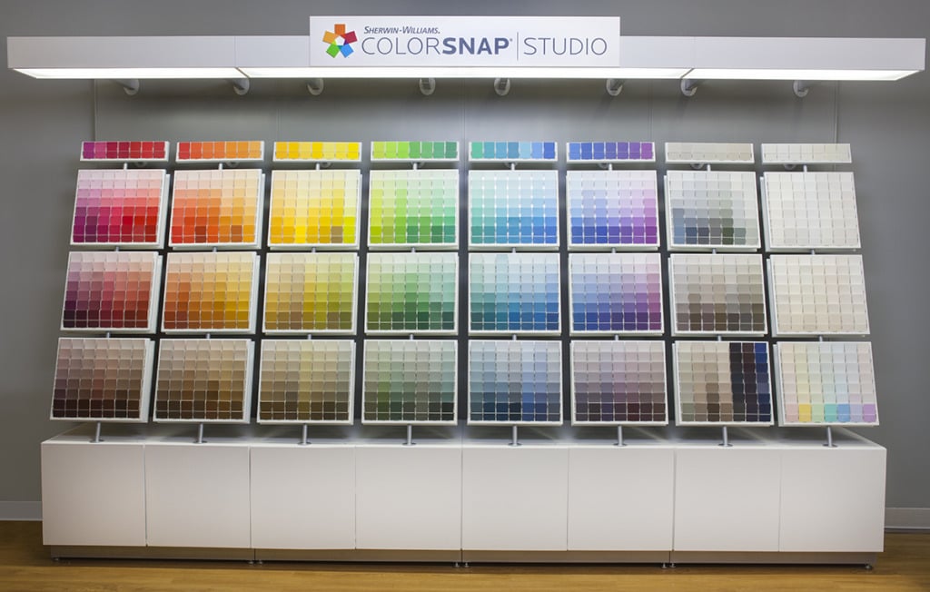
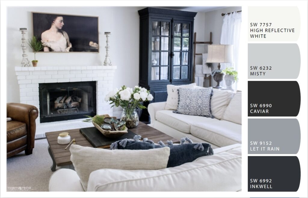
- If you have an inspiration image but still aren’t sure what colors to work with, try the Snap It Tool from Sherwin Williams as a starting point. Here’s how it worked with my family room:
- If you find a color you like but don’t like the brand of paint, ask about color matching. Almost all manufacturers can now color match to a competitor’s color.
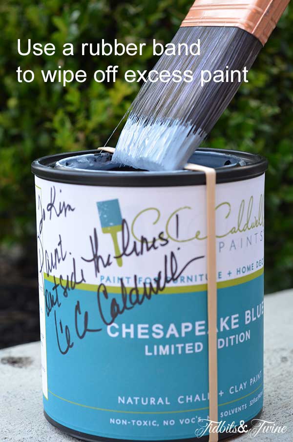
- When painting from a can, you can use a rubber band around the opening to wipe off your brush, keeping the paint from spilling into the rim.
- See a color you like but wish it were a bit lighter? Or maybe a bit darker? Paint stores can lighten and darken any color, usually by any percentage you specify. Just ask!
- Highly saturated colors often look beautiful on the paint strip, whereas softer colors sometimes look boring. But remember that you’re painting an entire space and highly saturated colors can overwhelm a space. When looking for the perfect color, don’t rule out the pale shades, as they are often the ones that are most pleasing on the walls.
- Trust your instincts! If you glance at a sample on your wall and your first reaction is that the color looks different than you thought or you hoped, then it’s probably not the right color for you. Often, your first reaction is the right one!
One final thought. There are literally thousands of paint colors available, so if you find yourself unsure or hesitant about a color, eliminate it from consideration and move on to other options. If you follow the tips above, then chances are when you find the right color, you’ll know it!
More DIY Articles
- 8 Beautiful Warm Whites for Your Home!
- Choosing Color: How to Identify the Undertone
- Behr Chalk Paint Review – How Does It Compare?
- The BEST Way to Test Paint Colors in Your Home!

Join the Community
Let’s keep in touch! Get exclusive artwork plus the latest news delivered directly to your Inbox!